



Accessible summary
What this session covers
This intermediate session follows one presentation from its first slides through to inclusive delivery. It explains how clear purpose, consistent structure, meaningful visuals, accessibility checks and presentation features can help more people identify and follow the message.
- defining the purpose, audience and key message before designing
- shaping the story with Outline view
- using built-in layouts, placeholders, themes and Slide Master
- organising slides with sections and consistent patterns
- creating visual hierarchy and reducing competing detail
- using visuals, alternative text and colour cues meaningfully
- checking reading order and accessibility before sharing
- delivering with captions, translation, Presenter View and PowerPoint Live
Making the session work for you
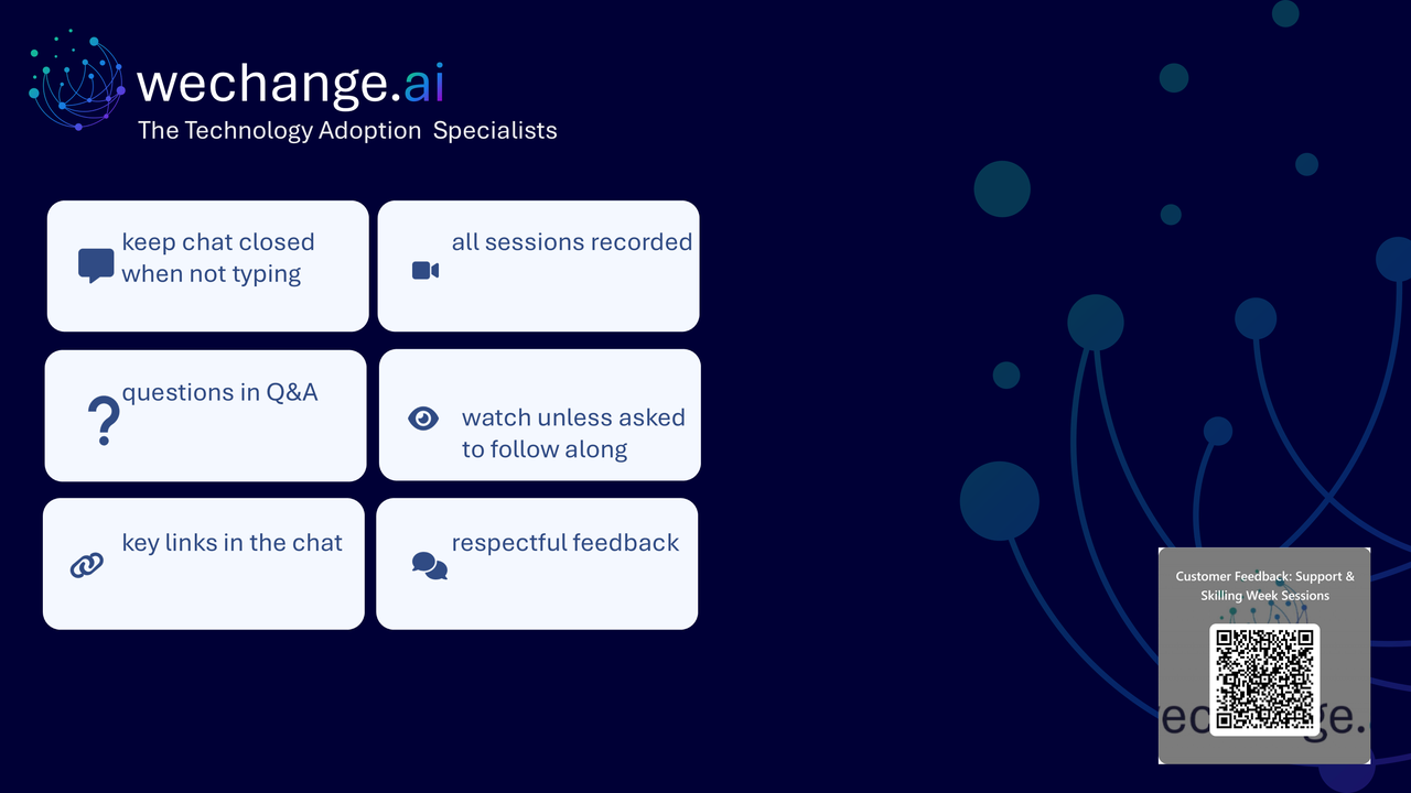
The session is delivered through a Microsoft Teams webinar using PowerPoint Live. You can personalise how you follow and take part. The session is recorded, and you can watch rather than follow along unless the trainer asks you to try something.
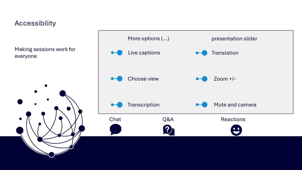
- use live captions or translation from the three-dots menu
- choose a view that gives you the clearest layout
- use the presentation slider to zoom in or out
- keep your camera and microphone off unless you are invited to use them
- use Q&A for questions and keep chat closed when you are not typing
- use reactions or another participation route if that works better for you
- share respectful feedback and use the key links provided in chat
Everyone can build confidence
These sessions are for everyone, whatever your starting point. You do not need to remember every design feature. The aim is to follow a dependable route from defining the message to checking and delivering the presentation inclusively.
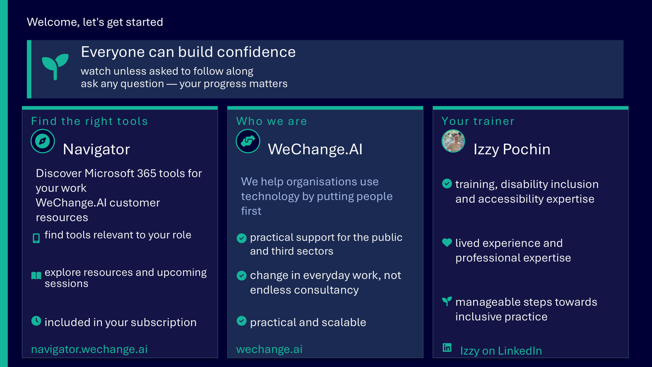
Navigator and WeChange.AI
Navigator is a personalised platform for WeChange.AI customers. It helps you find Microsoft 365 tools, resources and upcoming sessions relevant to your role.
WeChange.AI supports public and third sector organisations to use technology with confidence, purpose and impact. The focus is practical, people-centred change in day-to-day work.
Key concepts
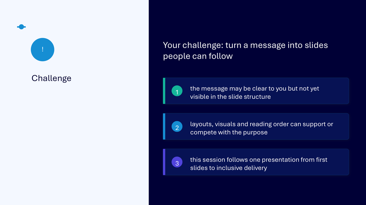
The challenge
The challenge visual shows that a message may be clear to the presenter but not yet visible in the slide structure. Layouts, visuals and reading order can either support or compete with the purpose. The session therefore improves one presentation step by step rather than treating features as disconnected tools.
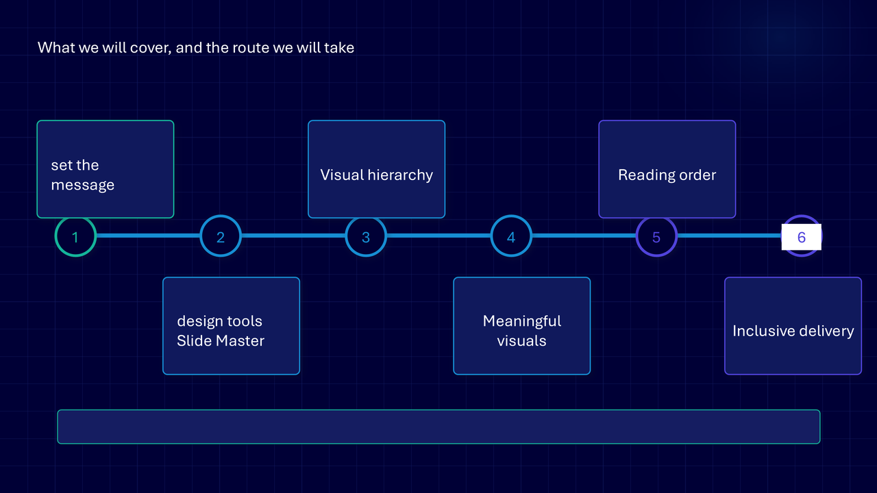
Your route through the session
The route graphic presents six connected stages.
- set the message
- use design tools and Slide Master
- create visual hierarchy
- use meaningful visuals
- check reading order
- deliver inclusively
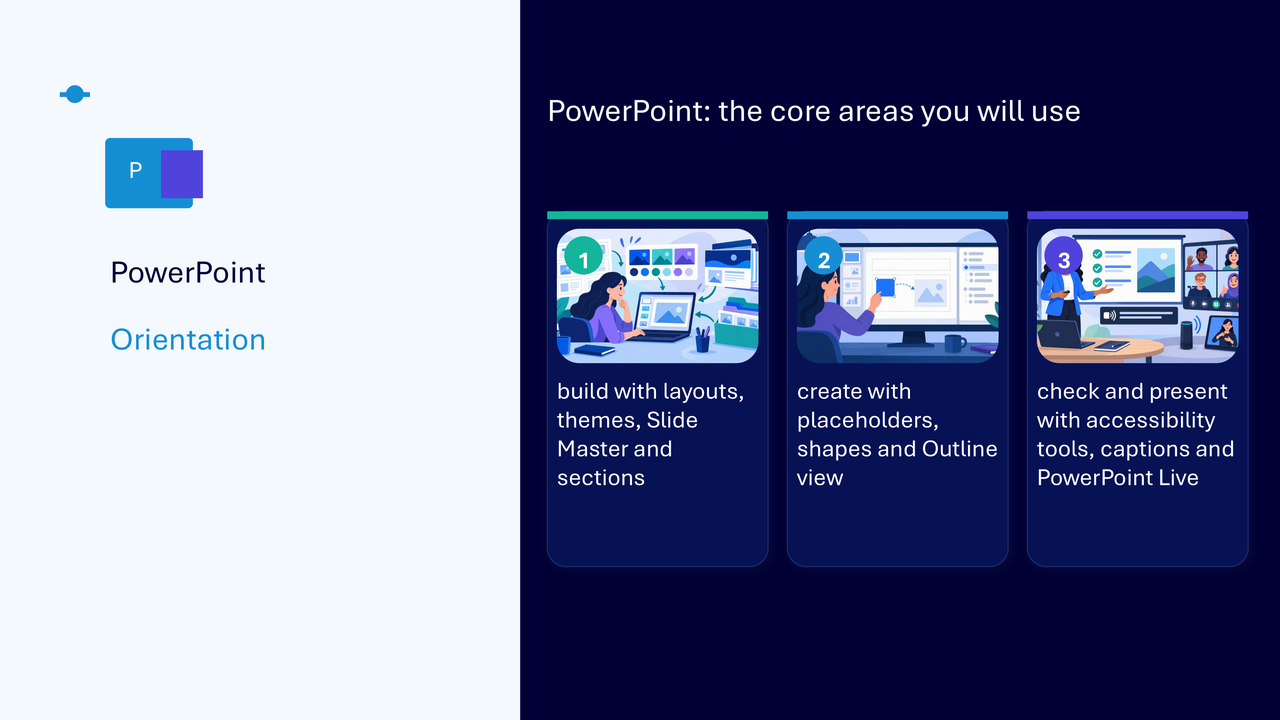
PowerPoint’s core working areas
The orientation visual groups the tools by what they help you do.
- build with layouts, themes, Slide Master and sections
- create with placeholders, shapes and Outline view
- check and present with accessibility tools, captions and PowerPoint Live
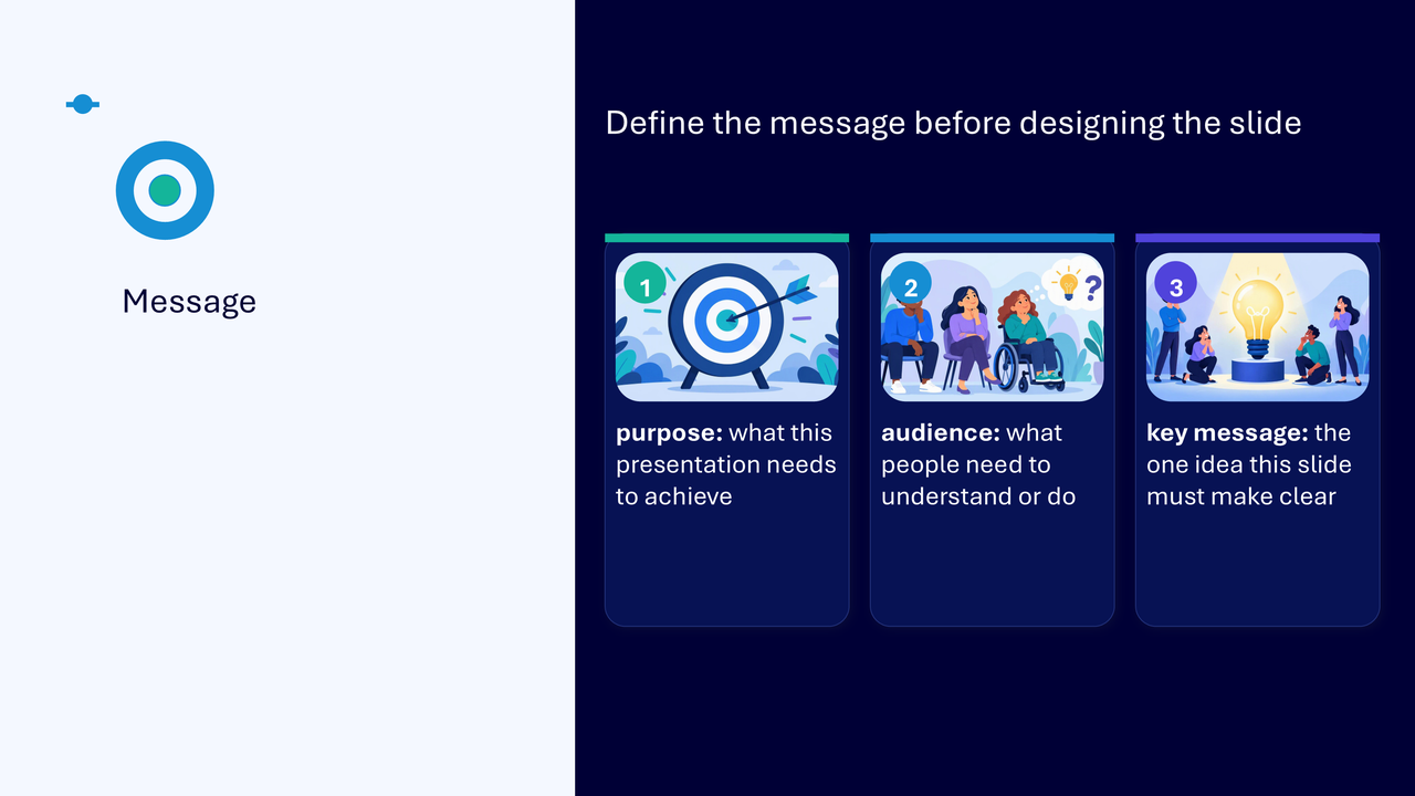
Define the message before designing
- purpose: state what the presentation needs to achieve
- audience: identify what people need to understand or do
- key message: write the one idea the slide must make clear
- complete the message statement before opening design tools
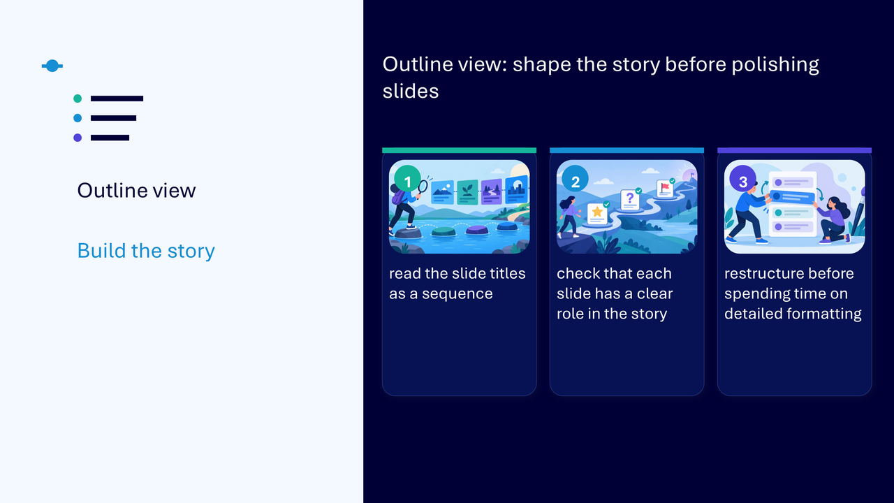
Shape the story with Outline view
Outline view lets you review slide titles and main text as a sequence before spending time on detailed formatting.
- read slide titles in order
- check that each slide has a clear role in the story
- restructure the sequence when it does not support the message
- return to slide editing after the story is coherent
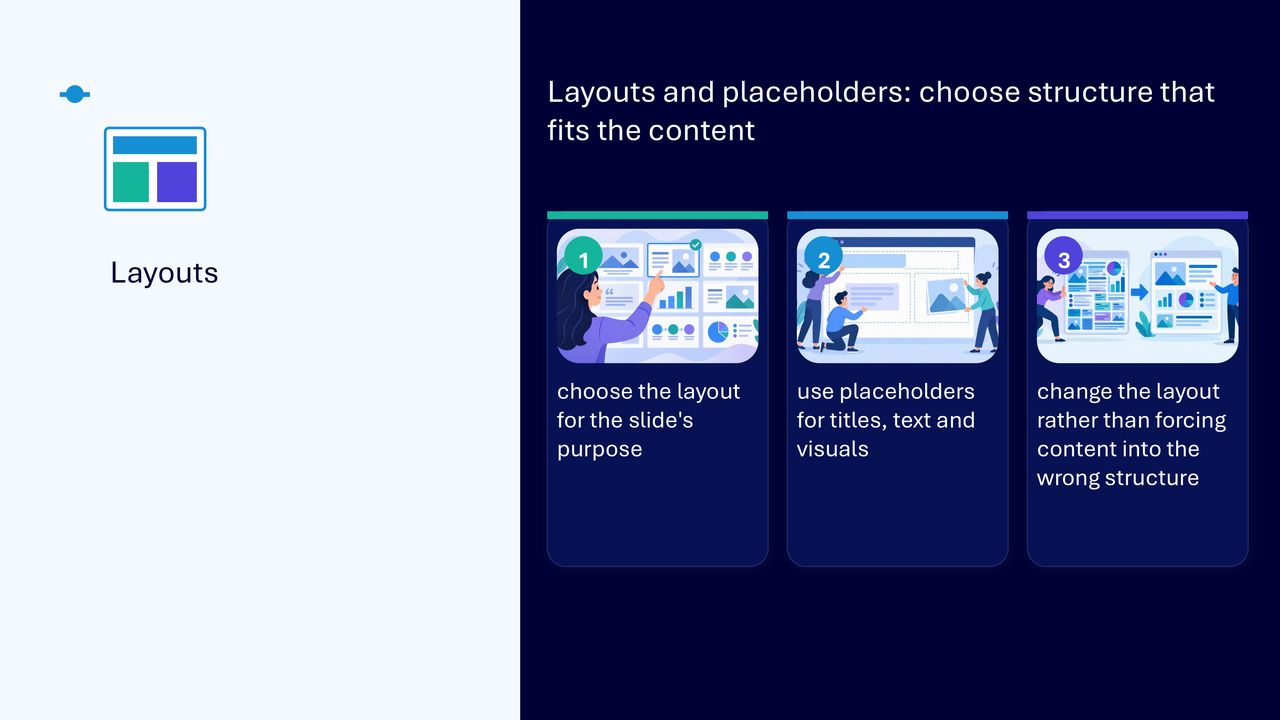
Use layouts and placeholders
Built-in layouts provide a reliable structure for titles, text and visuals. Choose the layout for the slide’s purpose rather than forcing content into manually placed text boxes.
- select Home and then Layout
- choose a structure that fits the content
- move titles, text and visuals into placeholders
- change the layout when the current structure does not fit
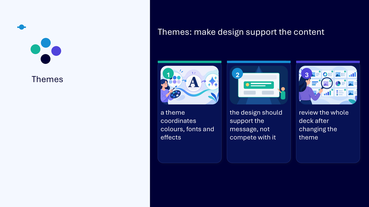
Use themes to support the content
A theme coordinates colours, fonts and effects across the presentation.
- choose a theme that supports rather than competes with the message
- review the whole deck after changing a theme
- check that text, visuals and emphasis remain clear across different slide types
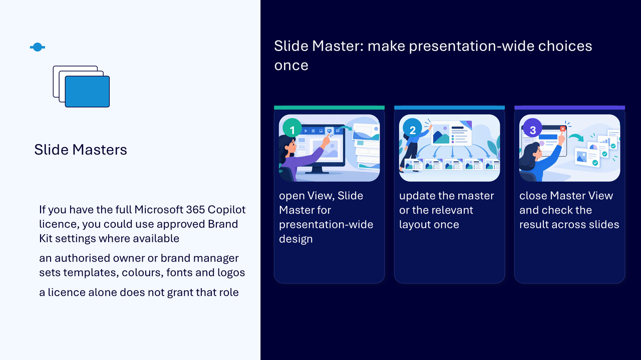
Use Slide Master for presentation-wide choices
Slide Master is for design decisions that should apply across the presentation or a particular layout.
- open View and then Slide Master
- update the master or the relevant layout once
- close Master View and check the result across slides
- use a layout-level change when only one slide pattern needs the update
If you have the full Microsoft 365 Copilot licence, approved Brand Kit settings may be available. An authorised owner or brand manager sets templates, colours, fonts and logos. A licence alone does not grant that role.
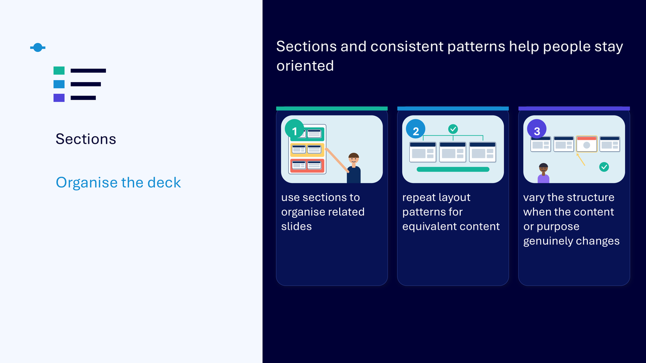
Use sections and consistent patterns
- use sections to organise related slides
- give sections meaningful names
- repeat layout patterns for equivalent content
- vary the structure when the content or purpose genuinely changes
Create visual hierarchy
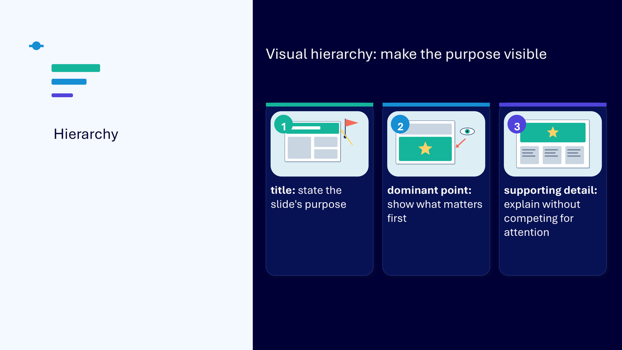
Visual hierarchy makes the slide’s purpose and priority easier to identify.
- title: state the slide’s purpose
- dominant point: show what matters first
- supporting detail: explain without competing for attention
- use size, position, spacing and emphasis deliberately
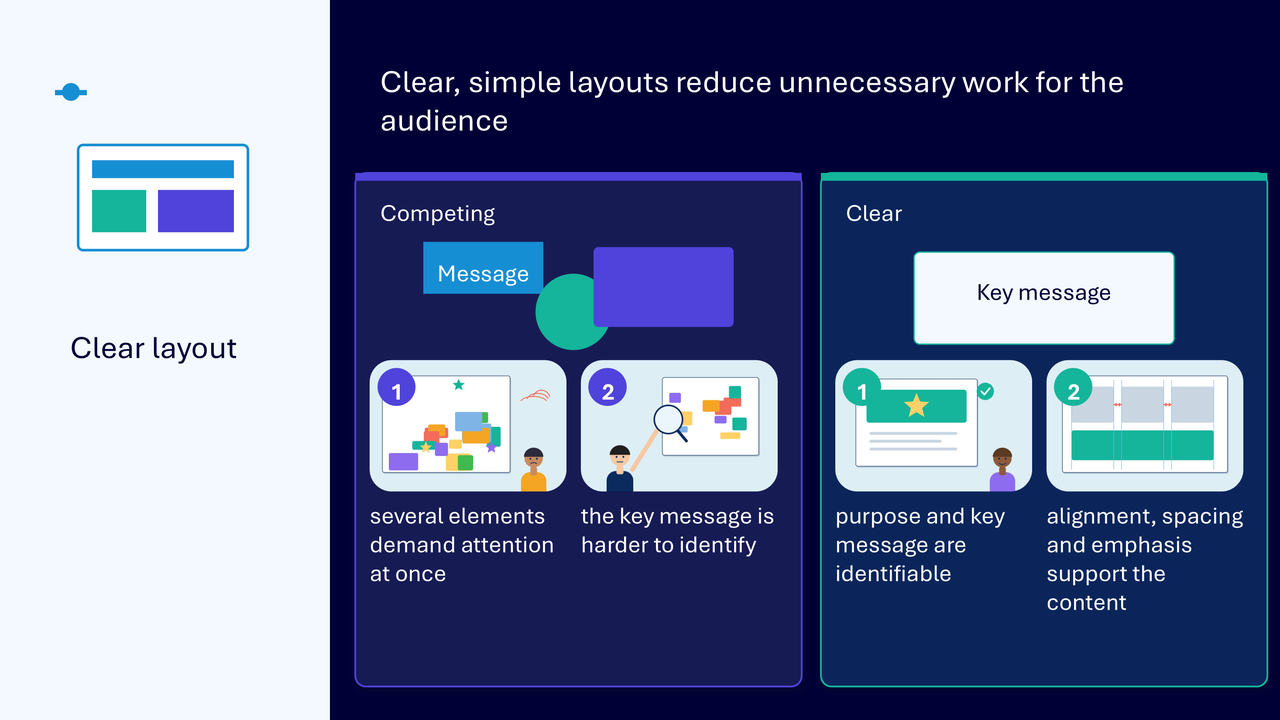
Reduce unnecessary work for the audience
The clear-layout comparison shows the same message presented in two ways. In the competing version, several elements demand attention and the key point is harder to identify. In the clearer version, alignment, spacing and emphasis make the purpose and key message recognisable.
Make visuals meaningful
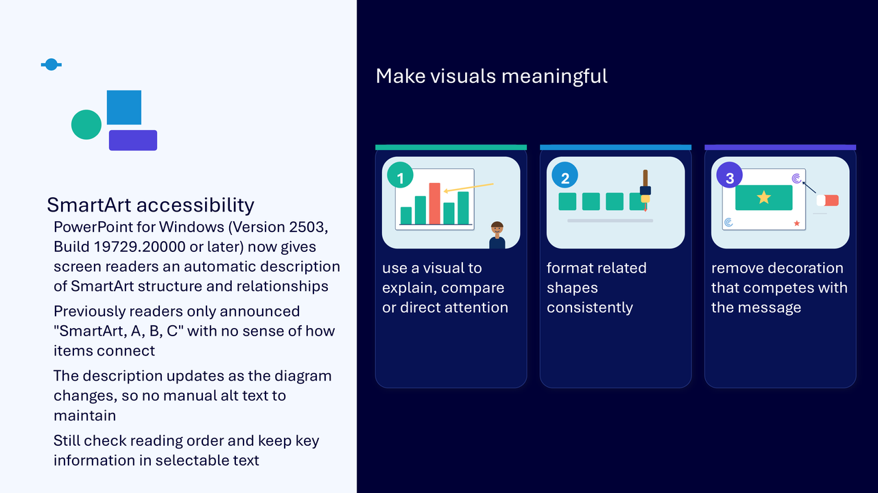
- use a visual to explain, compare or direct attention
- format related shapes consistently
- remove decorative elements that compete with the message
- keep important information in selectable text
- review the surrounding explanation and reading order
Where available, PowerPoint may describe SmartArt structure and relationships. This support does not replace checking the information, surrounding explanation and logical reading order.
Write useful alternative text
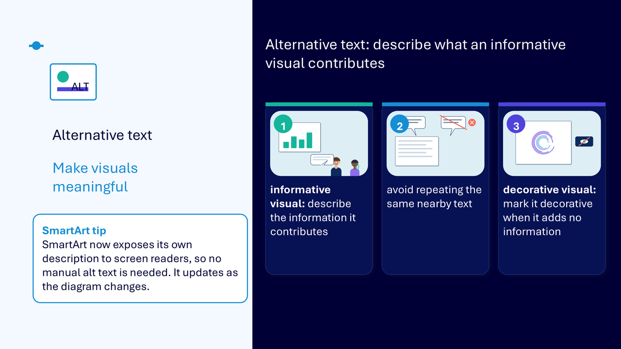
- describe the information an informative visual contributes
- avoid repeating the same nearby text
- mark a visual decorative when it adds no information
- write for the purpose of the visual rather than listing every visible detail
Do not rely on colour alone
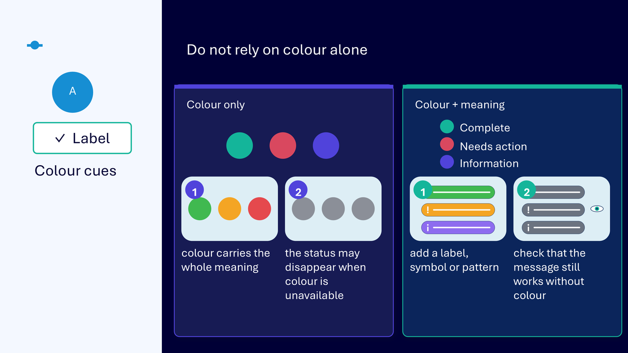
Colour should reinforce meaning rather than carry it by itself.
- add a label, symbol or pattern to each status or category
- check that the message still works when colour is unavailable
- use sufficient contrast so text and important detail remain readable
Check reading order
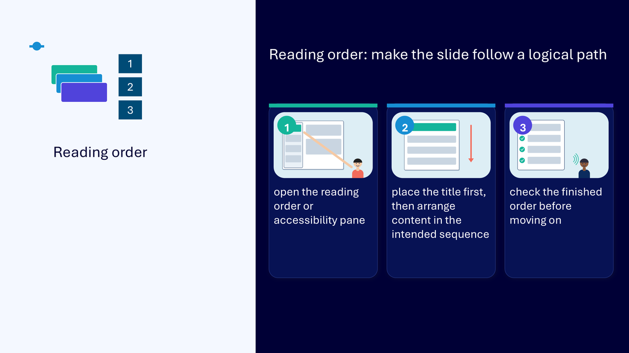
Reading order determines the sequence in which slide objects are presented to people using assistive technology.
- open the reading order or accessibility pane
- place the slide title first
- arrange the remaining content in the intended logical sequence
- read the finished order back and check it before moving on
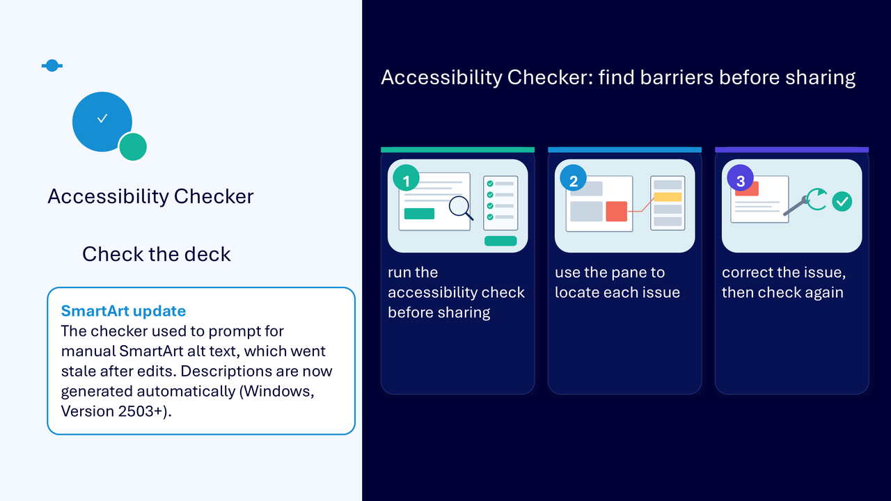
Use Accessibility Checker before sharing
- run the accessibility check
- use the pane to locate each identified issue
- make a practical correction
- run the check again
- apply human judgement to meaning, purpose and the usefulness of descriptions
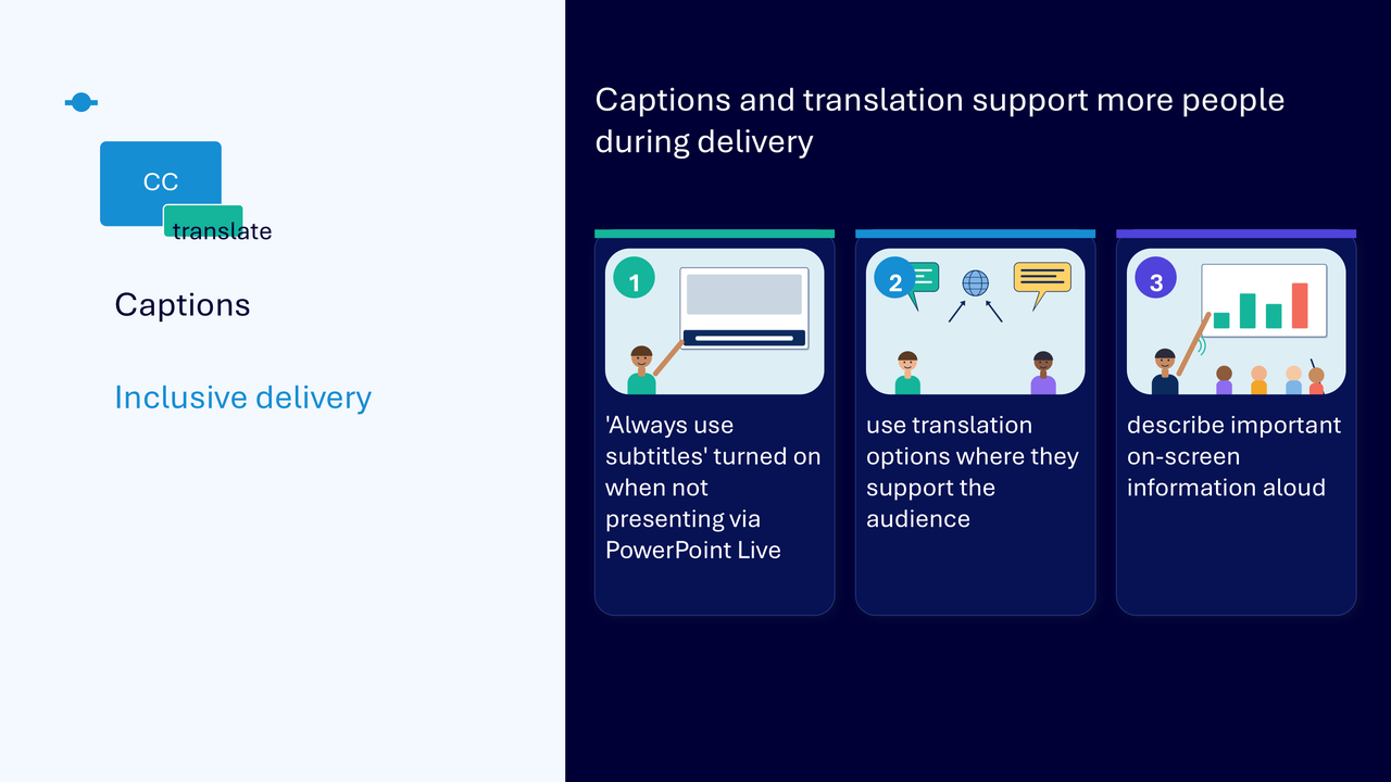
Use captions and translation during delivery
- turn on Always use subtitles when not presenting through PowerPoint Live
- use translation options when they support the audience
- tell participants which options are available
- describe important on-screen information aloud
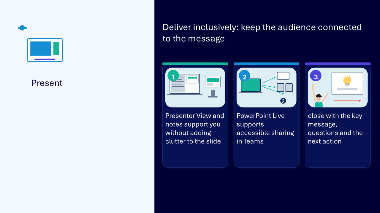
Deliver inclusively
- use Presenter View and presenter notes without adding clutter to the slide
- use PowerPoint Live for accessible sharing in Teams
- close by restating the key message
- invite questions and identify the next action
What the visuals and demonstrations showed
The visual sequence followed one deck from its message and story through structure, visual design, accessibility checking and inclusive delivery.
- writing the purpose, audience and key message
- reading slide titles as a sequence in Outline view
- moving manually placed content into a built-in layout and placeholders
- applying a theme and reviewing the whole deck
- making a presentation-wide change through Slide Master
- using sections and repeated patterns
- making the title and dominant point easier to identify
- removing competing decoration
- adding alternative text to an informative visual
- marking a decorative item as decorative
- adding labels or symbols so colour is not the only cue
- correcting the logical reading order
- running Accessibility Checker and checking again after a correction
- using captions, translation, Presenter View and PowerPoint Live
Key takeaways
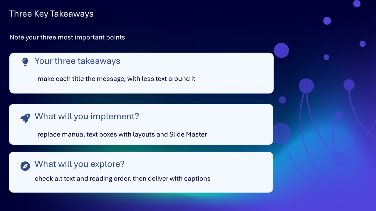
- make each slide title carry the message, with less competing text around it
- replace manual text boxes with built-in layouts, placeholders and Slide Master
- use visuals to explain rather than decorate
- check alternative text and reading order
- run Accessibility Checker and apply human judgement
- deliver with captions and describe important on-screen information aloud
A clear route from message to delivery
- define the purpose, audience and key message
- shape the story before polishing slides
- use layouts, themes and Slide Master for consistent structure
- create a clear visual hierarchy
- make visuals meaningful and accessible
- check reading order and accessibility
- deliver with inclusive presentation options
Actions you can take
Try the tip of the month
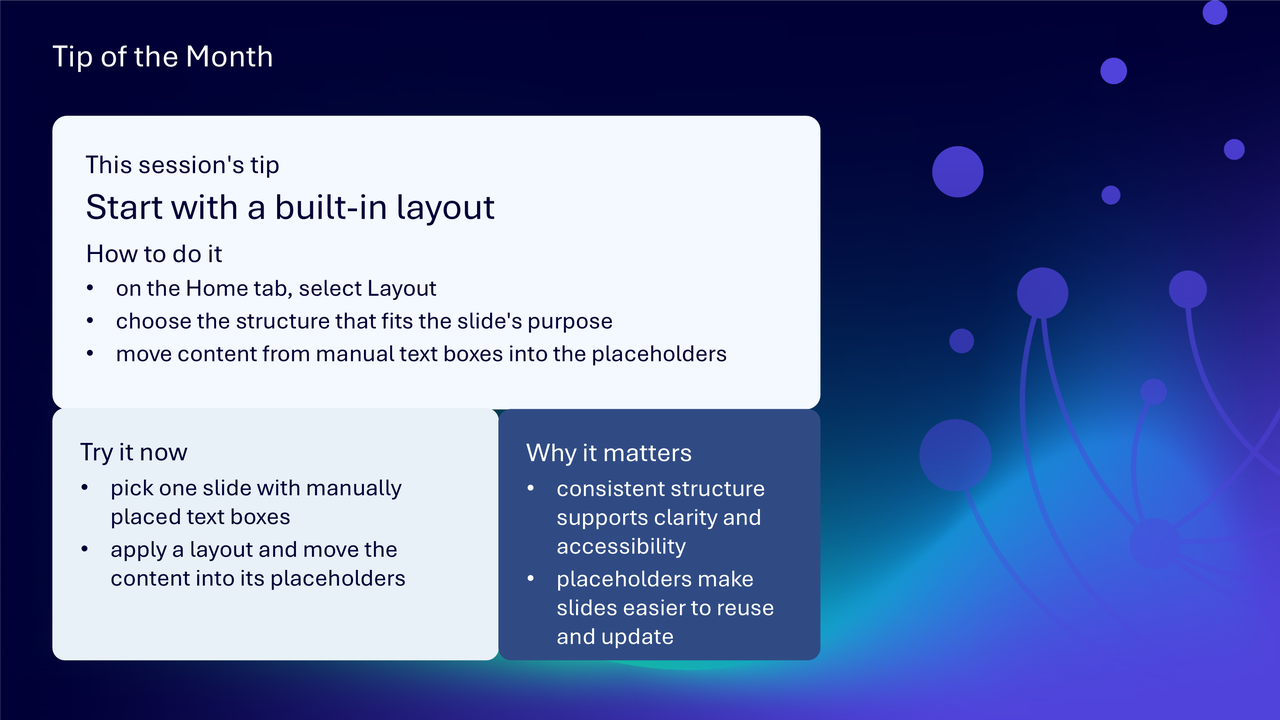
This session’s tip: start with a built-in layout
How to do it: on the Home tab, select Layout, choose the structure that fits the slide’s purpose and move content from manual text boxes into placeholders
Why it matters: consistent structure supports clarity and accessibility, while placeholders make slides easier to reuse and update
Try it now: choose one slide with manually placed text boxes, apply a layout and move the content into its placeholders
Build confidence with one practical route
- choose one existing presentation and write its purpose and audience
- read the slide titles as a sequence
- rewrite one title so it states the slide’s message
- replace manual text boxes on one slide with a built-in layout
- check whether the theme supports the content
- remove one decorative element that competes with the message
- add alternative text to one informative visual
- add a label or symbol to one colour-coded status
- check the slide’s reading order
- run Accessibility Checker and correct one issue
- plan how captions and on-screen descriptions will be used during delivery
Questions and feedback
Questions are welcome. If something is unclear, ask for it to be explained another way or demonstrated again. Feedback helps WeChange.AI understand what matters to you.
Complete the Support and Skilling Week feedback form
Contact WeChange.AI
For skilling queries, email training@wechange.ai.
Andrew Boxall, Managing Director: andrew@wechange.ai
Paul Ford, Industry Director for Education and Philanthropies: paul@wechange.ai
Josh Wilson, Industry Specialist: josh@wechange.ai
Elle Avilla, Customer Success and Delivery Skilling Lead: elle@wechange.ai
Izzy Pochin, Resources and Accessibility Lead: izzy@wechange.ai
Activity sheet
Follow one presentation from its message and structure through to meaningful visuals, accessibility checks and inclusive delivery.
How to use this activity sheet
This sheet supports Session 11: Microsoft PowerPoint. Use it after the live session, or follow selected steps while your trainer demonstrates one presentation scenario from first slides to delivery.
- work at your own pace and pause after each activity
- use a new practice presentation or non-sensitive content
- save a separate practice copy before making presentation-wide changes
- your screen may differ between PowerPoint on the web and the desktop application
- keep important information in selectable text rather than only inside an image
What you will achieve
- define the purpose, audience and key message before designing
- use Outline view to test the story
- choose built-in layouts and placeholders
- use themes, Slide Master and sections for consistent structure
- create a clear visual hierarchy
- use meaningful visuals, alternative text and non-colour cues
- check and correct reading order
- run Accessibility Checker and complete a human review
- deliver with captions, Presenter View, notes and PowerPoint Live where appropriate
Your learning route
| Stage | You will practise |
|---|---|
| 1. Set the message | purpose, audience and key message |
| 2. Shape the story | Outline view and slide sequence |
| 3. Use design tools | layouts, themes, Slide Master and sections |
| 4. Create hierarchy | title, dominant point and supporting detail |
| 5. Make visuals meaningful | alt text, labels and selectable text |
| 6. Check the slide | reading order and Accessibility Checker |
| 7. Deliver inclusively | captions, notes, Presenter View and PowerPoint Live |
Before you start
- open PowerPoint and create a short practice presentation
- save it with a clear practice filename
- include a title slide and three content slides
- add one informative visual and one decorative visual
- avoid personal, confidential or sensitive information
- allow about 45 to 60 minutes, or complete one activity at a time
Notice: Some features differ between PowerPoint on the web, the desktop application, Teams and organisational licences. Use the version and presentation route provided by your organisation.
Activity 1: Define the message before designing
Outcome: State what the presentation and current slide need to achieve.
- Name the audience.
- Write the action, understanding or decision the presentation should support.
- Write the one key message for the current slide.
- Remove one detail that does not support that message.
- Rewrite the slide title so it communicates purpose rather than only naming a topic.
| Planning question | Your answer |
|---|---|
| Who is the audience? | |
| What should they understand or do? | |
| What is the presentation purpose? | |
| What is this slide’s key message? |
Pause and check
Activity 2: Shape the story in Outline view
Outcome: Review slide titles as a sequence before spending time on detailed formatting.
- Open Outline view.
- Read the slide titles in order.
- Check that each slide has a distinct role.
- Move one practice slide if the sequence is unclear.
- Rewrite a title that does not explain its role.
- Return to Normal view and check the revised story.
The story in one sentence: ____________________________________________________________________
The structural change I made: ____________________________________________________________________
Pause and check
Activity 3: Use a built-in layout and placeholders
Outcome: Replace manually positioned text boxes with a structure that fits the slide’s purpose.
- Choose a slide with manually placed content.
- On the Home tab, open Layout.
- Choose a layout that matches the content.
- Move the title, text and visual into the placeholders.
- Change the layout if the structure is not suitable rather than forcing the content.
- Check that no content was lost or duplicated.
| Placeholder | Content |
|---|---|
| title | |
| main text | |
| visual or media | |
| supporting content, if needed |
Notice: Layouts are a reliable starting point, not a demand for identical slides. Use a different structure when the content or purpose genuinely changes.
Pause and check
Activity 4: Apply a theme and review the deck
Outcome: Coordinate colours, fonts and effects while keeping the content clear.
- Open the Design tab.
- Apply an approved or appropriate theme to the practice deck.
- Review every slide rather than checking only the selected slide.
- Check that titles, body text and visuals remain readable.
- Undo the theme change if it competes with the content or breaks the intended structure.
The theme or design choice: ____________________________________________________________________
A slide that needed attention: ____________________________________________________________________
Pause and check
Activity 5: Make a presentation-wide change with Slide Master
Outcome: Make one consistent choice once and check its effect across the presentation.
- Open View, then Slide Master.
- Identify whether the change belongs on the main master or one layout.
- Make one safe practice change, such as a shared title treatment or footer position.
- Close Master View.
- Review the result in Normal view across all relevant slides.
- Undo or correct any unintended effect.
The presentation-wide change: ____________________________________________________________________
Where I applied it and why: ____________________________________________________________________
Pause and check
Activity 6: Organise the deck with sections
Outcome: Group related slides and use consistent patterns for equivalent information.
- Create a section for a related group of slides.
- Give the section a meaningful name.
- Identify slides that present equivalent content.
- Apply a consistent layout pattern to those slides.
- Keep a different layout only where the content or purpose genuinely changes.
The section name: ____________________________________________________________________
The repeated pattern: ____________________________________________________________________
The justified variation: ____________________________________________________________________
Pause and check
Activity 7: Create a clear visual hierarchy
Outcome: Make the title, dominant point and supporting detail easy to recognise.
- Rewrite the title so it states the slide’s purpose.
- Identify the one dominant point.
- Use the title placeholder to achieve good position, size and emphasis to make that point noticeable first.
- Reduce the emphasis of supporting detail using suitable layouts.
- Align related items and use consistent spacing.
- View the slide at presentation size and identify what you notice first.
| Hierarchy level | Your content |
|---|---|
| title or purpose | |
| dominant point | |
| supporting detail |
Pause and check
Activity 8: Make a visual meaningful
Outcome: Use imagery, shapes or SmartArt to explain, compare or direct attention rather than decorate.
- Choose one informative visual.
- Write what it contributes to the slide message.
- Format related shapes consistently.
- Remove one decorative element that competes with the purpose.
- Keep essential labels and conclusions in selectable text.
- Check the surrounding explanation.
What the visual contributes: ____________________________________________________________________
The decoration I removed: ____________________________________________________________________
Pause and check
Activity 9: Add useful alternative text
Outcome: Describe the contribution of informative visuals and remove decorative noise from the reading experience.
- Select the informative visual.
- Open the alternative text option.
- Describe the information or purpose the visual contributes.
- Avoid repeating the same nearby text.
- Select a purely decorative object.
- Mark it decorative where that option is available.
- Review the slide with the visible text and alternative text considered together.
| Visual | Treatment | Reason |
|---|---|---|
| informative visual | alternative text | |
| decorative visual | mark decorative |
Pause and check
Activity 10: Do not rely on colour alone
Outcome: Add labels, symbols or patterns so meaning remains available without colour.
- Find a status, category or comparison currently shown by colour.
- Add a visible label, symbol or pattern.
- Check that the status remains understandable without colour.
- Check text and background contrast.
- State the meaning in plain language.
The colour cue: ____________________________________________________________________
The added label, symbol or pattern: ____________________________________________________________________
The meaning without colour: ____________________________________________________________________
Pause and check
Activity 11: Correct the reading order
Outcome: Arrange slide objects in the logical sequence an assistive technology user should encounter.
- Open the Reading Order or Accessibility pane.
- Locate the slide title.
- Place the title first.
- Arrange the remaining content in the intended logical sequence.
- Exclude decorative objects.
- Read the order back from beginning to end.
- Check the finished sequence before closing the pane.
| Order | Object or content |
|---|---|
| 1 | title |
| 2 | |
| 3 | |
| 4 |
Pause and check
Activity 12: Run Accessibility Checker
Outcome: Locate potential barriers, correct selected issues and check again.
- Run PowerPoint Accessibility Checker.
- Select one issue in the pane.
- Locate the related object on the slide.
- Read the reason and recommended action.
- Make a practical correction.
- Run the check again.
- Complete a human review of meaning, contrast, labels, alternative text and reading order.
| Check | Finding | Action |
|---|---|---|
| slide title | ||
| alternative text | ||
| reading order | ||
| colour and contrast | ||
| other checker issue | ||
| human review |
Notice: Accessibility Checker supports review, but human judgement is still needed to decide whether the meaning, structure and descriptions genuinely help the audience.
Pause and check
Activity 13: Prepare inclusive delivery
Outcome: Use presentation features and delivery choices that help the audience remain connected to the message.
- Add concise presenter notes that support you without copying excessive text onto the slide.
- Open Presenter View and identify notes, current slide and next slide information.
- Turn on subtitles or captions for the presentation route you are using, where available.
- Review translation options if they support the audience.
- If presenting in Teams, identify the PowerPoint Live route.
- Plan where you will describe important on-screen information aloud.
- Close with the key message, questions and the next action.
| Delivery choice | Your plan |
|---|---|
| presenter notes | |
| captions or subtitles | |
| translation, if relevant | |
| PowerPoint Live or other sharing route | |
| visual description | |
| closing key message | |
| next action |
Pause and check
Put it into practice: from message to inclusive delivery
Scenario
A service team has a short presentation with vague titles, manual text boxes, decorative images, colour-only status indicators and an unclear reading order. It needs to support a live online briefing.
- define the purpose, audience and key message
- read the titles as a story in Outline view
- replace manual text boxes with suitable layouts and placeholders
- apply an approved theme and use Slide Master for shared changes
- create one dominant point per slide
- remove visuals that do not support the message
- add useful alternative text and non-colour labels
- correct the reading order
- run Accessibility Checker and complete a human review
- prepare notes, captions, visual description and the closing action
The presentation purpose: ____________________________________________________________________
The structural change: ____________________________________________________________________
The accessibility correction: ____________________________________________________________________
The delivery route: ____________________________________________________________________
The final key message and next action: ____________________________________________________________________
Quick reference: choose the PowerPoint tool
| If you need to… | Try… |
|---|---|
| shape the slide sequence | Outline view |
| give a slide reliable structure | built-in layouts and placeholders |
| coordinate colours, fonts and effects | an approved theme |
| make a shared design change once | Slide Master |
| group related slides | sections |
| make the main point recognisable | visual hierarchy |
| describe an informative image | alternative text |
| show meaning beyond colour | labels, symbols or patterns |
| create a logical assistive reading path | Reading Order or Accessibility pane |
| identify potential barriers | Accessibility Checker |
| support yourself while presenting | Presenter View and notes |
| share accessibly in Teams | PowerPoint Live, where appropriate |
| make spoken delivery available as text | captions or subtitles |
Your three takeaways
My most useful learning: ____________________________________________________________________
What I will implement: ____________________________________________________________________
What I will explore further: ____________________________________________________________________
If you need help
- describe whether you were using PowerPoint on the web or the desktop application
- name the slide, layout, pane or presentation mode involved
- note the exact wording of any Accessibility Checker issue
- keep a separate copy before practising Slide Master changes
- ask your local support route about templates, Brand Kit, captions or unavailable features
- avoid sharing screenshots containing personal, confidential or sensitive information
Confidence grows through a repeatable presentation journey: define the message, use reliable structure, make every visual purposeful, check the reading experience and deliver with the audience in mind.
Reflective journal
Why we ask you to reflect
Continuing Professional Development (CPD) is formative and it is about what it achieves for you and your organisation.
Instead of formally assessing your learning, we ask you to write a reflective note. This should reflect on how the learning was relevant and how it will impact your working practices.
Taking time to reflect on your learning makes it more likely you will embed it in your future practice.
What to cover and when
What your reflection should cover
- how the learning was relevant to you
- how the learning will impact your practice
When to complete it
Reflect as soon as possible following the skilling session. This keeps your note contemporaneous (written close to the time) and meaningful. Fill it in on your device, so the boxes expand as you type.
| Topic | What to know |
|---|---|
| Timing | Complete the note as soon as possible after the training event. |
| Purpose | To embed the learning within your subsequent practice. |
| Focus | How the learning was relevant and how it will impact your practice. |
Your reflective note
Complete each row below. Write in your own words. Your notes are private to you unless you choose to share them.
| Prompt | Your response |
|---|---|
| Skilling session title | |
| Date of the skilling session | |
| Date you completed this note | |
| How was the learning relevant to you and your work? | |
| How will the learning impact your practice? |
Recommended resources
These curated resources accompany the WeChange.AI skilling offer of Continuing Professional Development (CPD) accredited, and non-accredited, sessions. Use them before a session to build familiarity, or afterwards to revisit and apply the learning in day-to-day work.
Alongside these resources, Navigator helps WeChange.AI customers find personalised recommendations and available learning on Microsoft 365 tools, accessibility and AI relevant to their role. Returning to Navigator after a session can help you connect new knowledge with practical workplace needs, choose a useful next step and keep learning visible as confidence grows.
The PowerPoint support hub, with guidance on building and presenting slides. A useful bookmark for looking up a feature after the session.
Explains how changes made on the Slide Master apply to every slide, and how themes and layouts fit with it. It also helps explain why some elements cannot be edited in Normal view.
Gives steps for creating and customising slide masters, including colours, fonts, placeholders and footers. It recommends editing masters before you build individual slides.
Explains how to open the Alt Text pane and describe an object in one or two sentences. It also shows how to mark purely decorative visuals so screen readers skip them.
Shows how to use the Reading Order pane to put objects in a sensible sequence. It also explains grouping complex objects and excluding decorative ones.
Sets out best practices and how to use the Accessibility Checker in PowerPoint. A practical checklist to work through before you share.
Explains how to turn on live captions and subtitles while presenting. Helps audiences who need or prefer text alongside your voice.
Explains how Presenter view lets you see notes and controls while the audience sees only the slides. It also covers using it on one screen and swapping displays.