

Accessible summary
What this session covers
This enhanced session explains how to design a first Power Apps app around a real user or service need. It follows one coherent journey from defining the outcome and connecting suitable data to building screens, controls and forms, applying accessibility from the start, testing realistic and error paths, and planning ownership and maintenance.
- starting with the person, task and service outcome
- deciding whether a guided app is suitable
- mapping the journey before choosing screens and controls
- connecting an appropriate Microsoft Lists or SharePoint data source
- designing reliable fields, identifiers and status values
- building browse, detail and edit screens
- matching controls and forms to the information and action
- using clear labels, strong contrast and logical reading order
- testing larger text, keyboard movement and complete user journeys
- refining the smallest useful change and assigning ownership
Making the session work for you
The session is delivered through a Microsoft Teams webinar using PowerPoint Live. You can personalise how you follow and take part. The session is recorded, and you can watch rather than follow along unless the trainer asks you to try something.
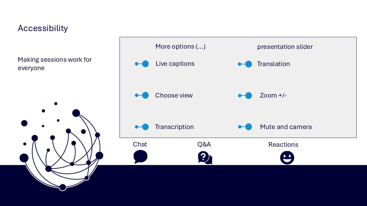
- use live captions or translation from the three-dots menu
- choose a view that gives you the clearest layout
- use the presentation slider to zoom in or out
- keep your camera and microphone off unless invited
- use Q&A for questions and keep chat closed when not typing
- use reactions or another participation route if that works better for you
- share respectful feedback and use the key links provided in chat
Everyone can build confidence
The aim is to build one complete and useful app journey rather than several unfinished features. Each screen and control should support a clear task and service outcome.
Navigator and WeChange.AI
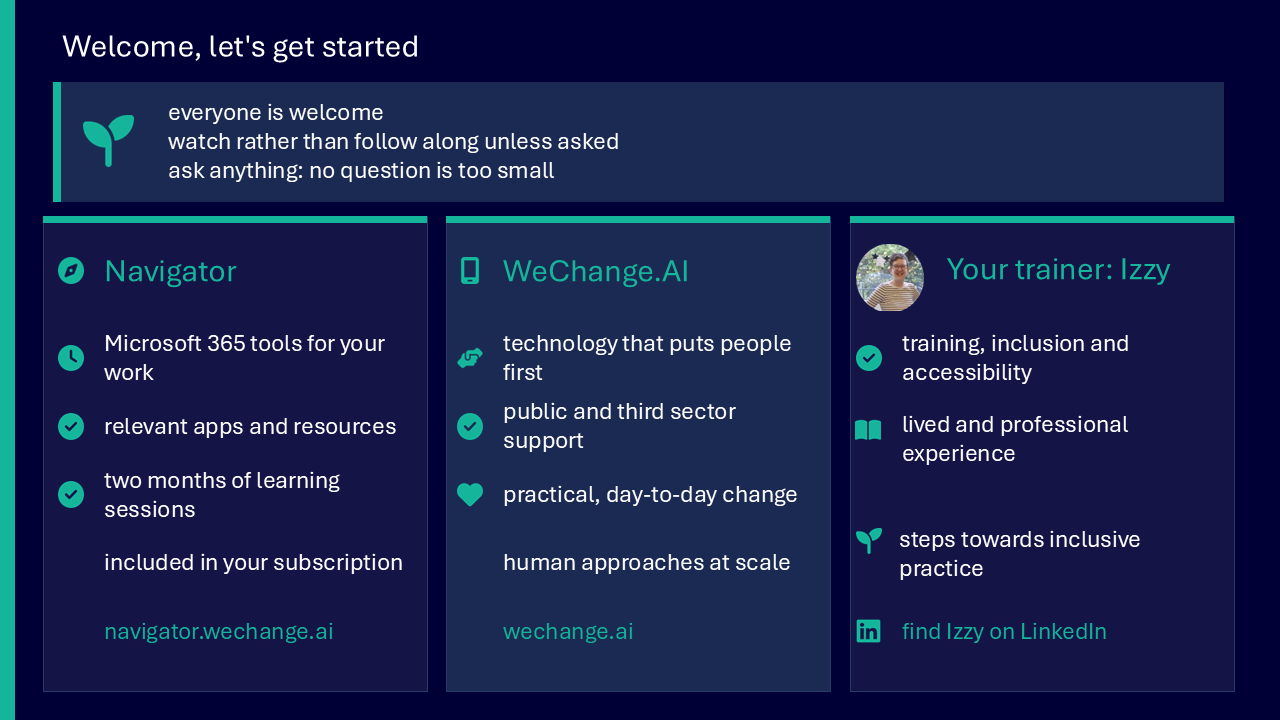
Navigator is a personalised platform for WeChange.AI customers. It helps you find Microsoft 365 tools, resources and upcoming sessions relevant to your role.
WeChange.AI supports public and third sector organisations to use technology with confidence, purpose and impact.
Key concepts
The challenge
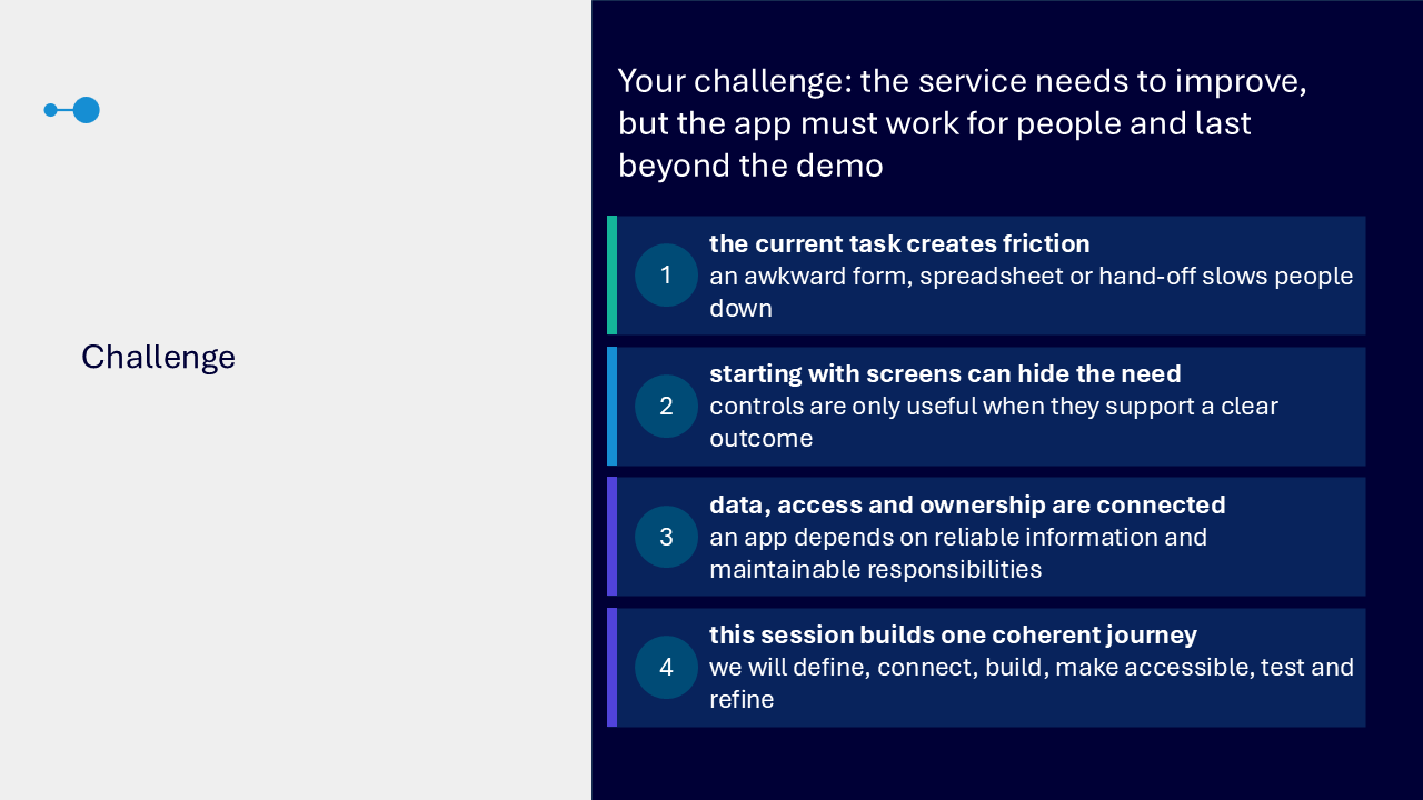
The challenge visual connects four risks. An awkward form, spreadsheet or hand-off can slow people down. Starting with screens can hide the actual need. Data, access and ownership are connected. An app must work for people and remain maintainable after the demonstration.
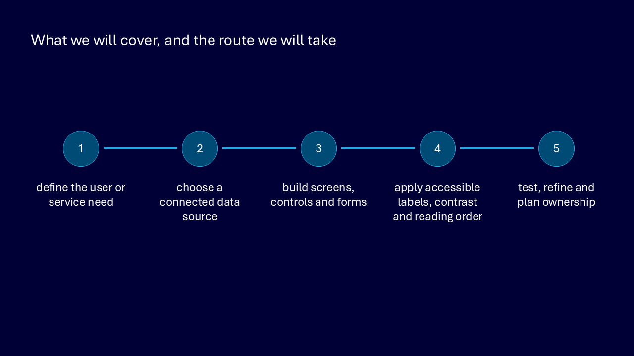
Your route through the session
- define the user or service need
- choose a connected data source
- build screens, controls and forms
- apply accessible labels, contrast and reading order
- test, refine and plan ownership
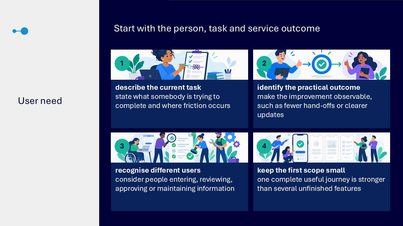
Start with the person, task and outcome
- describe what somebody is trying to complete and where friction occurs
- make the intended improvement observable, such as fewer hand-offs or clearer updates
- consider people entering, reviewing, approving or maintaining information
- keep the first scope small enough to complete and test
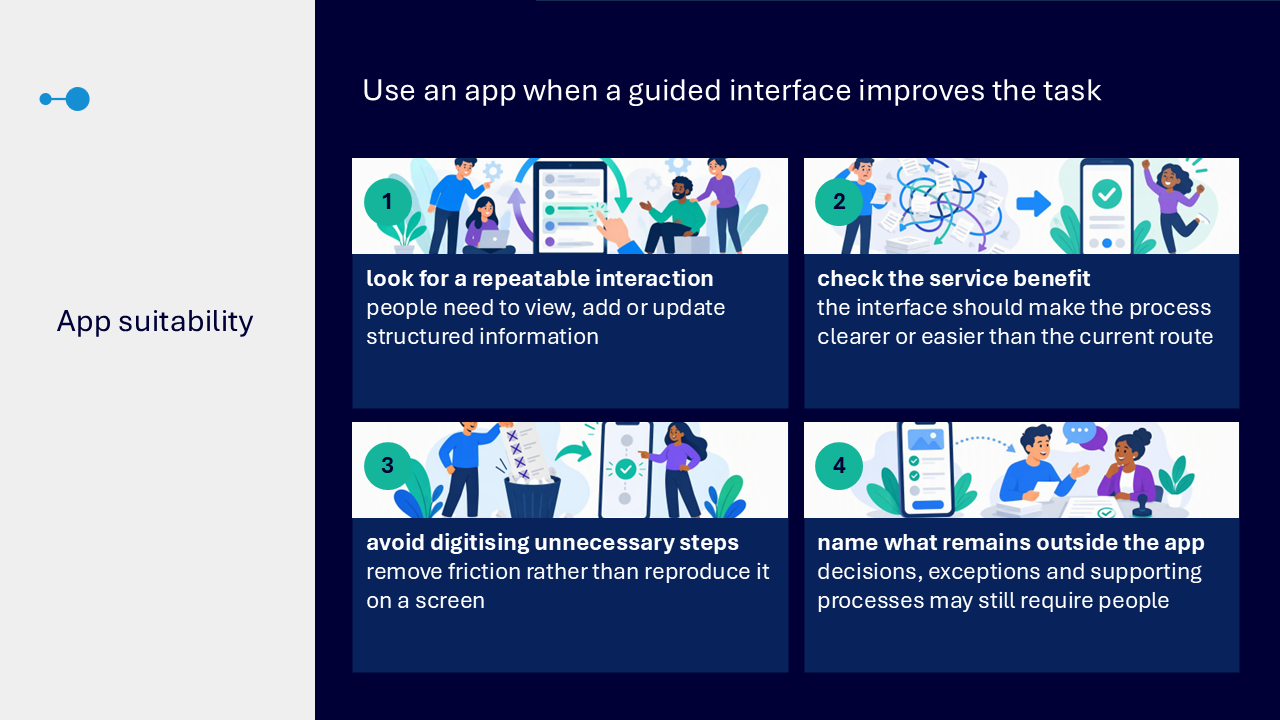
Check whether an app is suitable
- look for a repeatable interaction involving structured information
- confirm that a guided interface would make the process clearer or easier
- remove unnecessary steps rather than reproduce them on a screen
- identify decisions, exceptions or supporting processes that remain outside the app
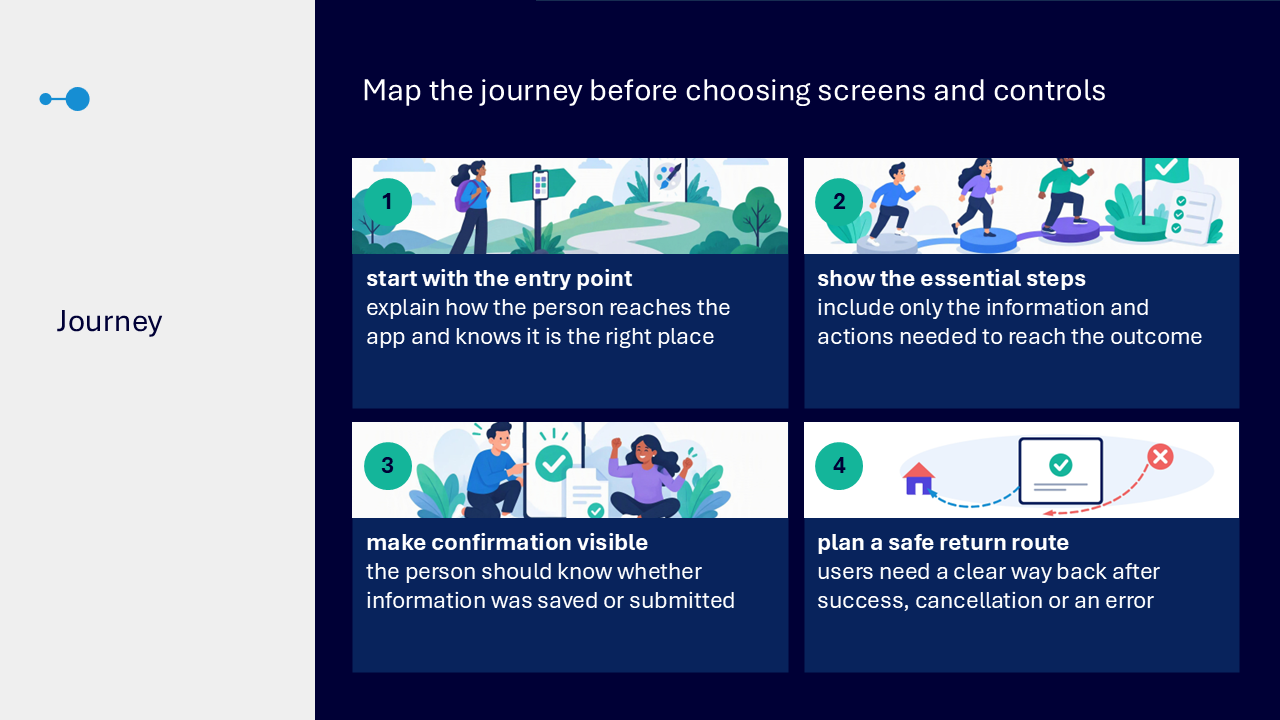
Map the complete journey
- explain how a person reaches the app and recognises its purpose
- include only the information and actions needed for the outcome
- make saving or submitting visible
- provide a safe route back after success, cancellation or an error
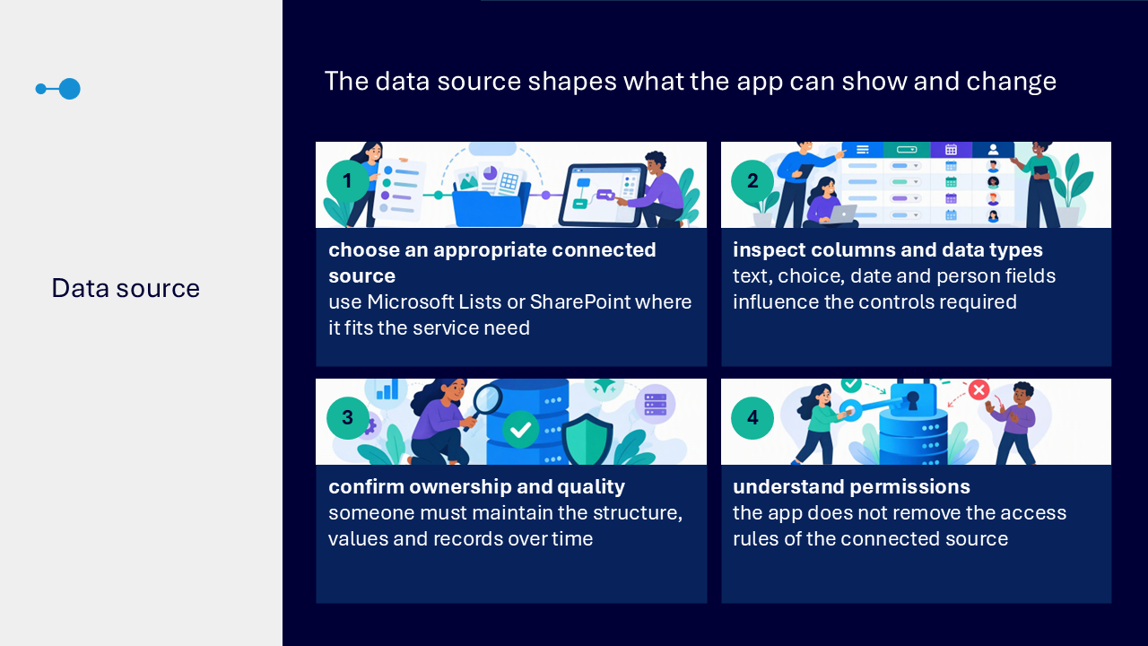
Choose the connected data source
- use Microsoft Lists or SharePoint where this fits the service need
- inspect text, choice, date and person columns because data types influence controls
- confirm who owns and maintains the data structure and records
- remember that the app does not remove the access rules of the connected source
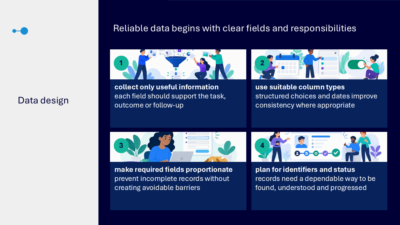
Design reliable data
- collect only information that supports the task, outcome or follow-up
- use suitable structured choices and dates where they improve consistency
- make required fields proportionate
- plan dependable identifiers and status values so records can be found and progressed
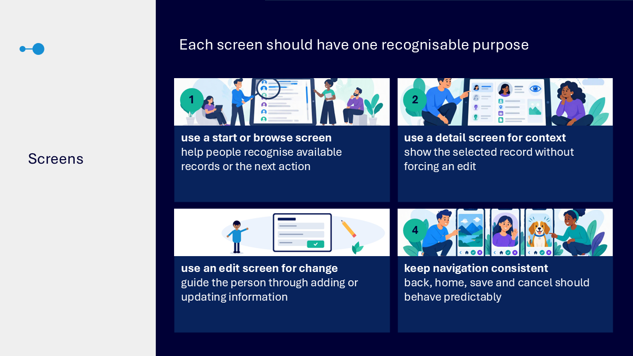
Give each screen one purpose
- use a start or browse screen to show available records or the next action
- use a detail screen to show context without forcing an edit
- use an edit screen to guide adding or updating information
- keep back, home, save and cancel behaviour consistent
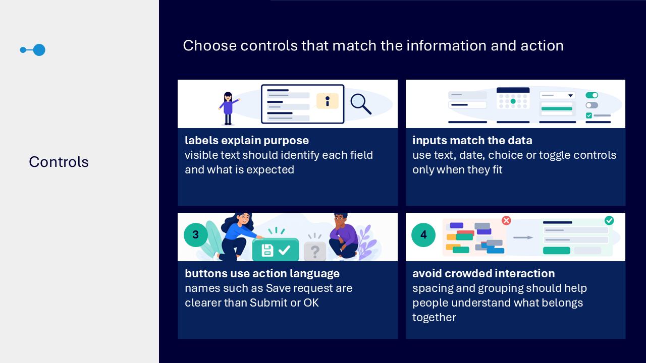
Choose controls that fit the information
- use visible labels that identify each field and what is expected
- match text, date, choice or toggle controls to the data
- label buttons with the action, such as Save request
- use spacing and grouping to show what belongs together
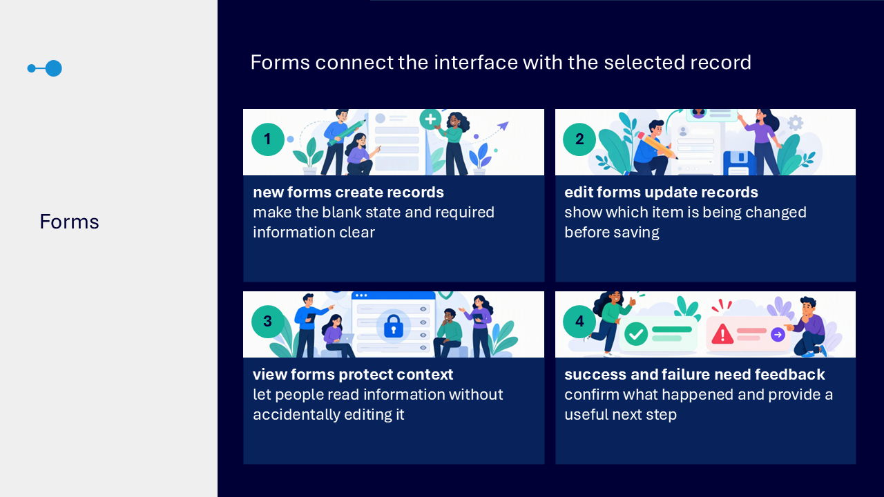
Use forms for the correct record state
- use new forms to create records and make required information clear
- use edit forms to show which record is being changed
- use view forms to protect context from accidental editing
- provide clear feedback after success or failure and a useful next step
Write accessible labels and errors
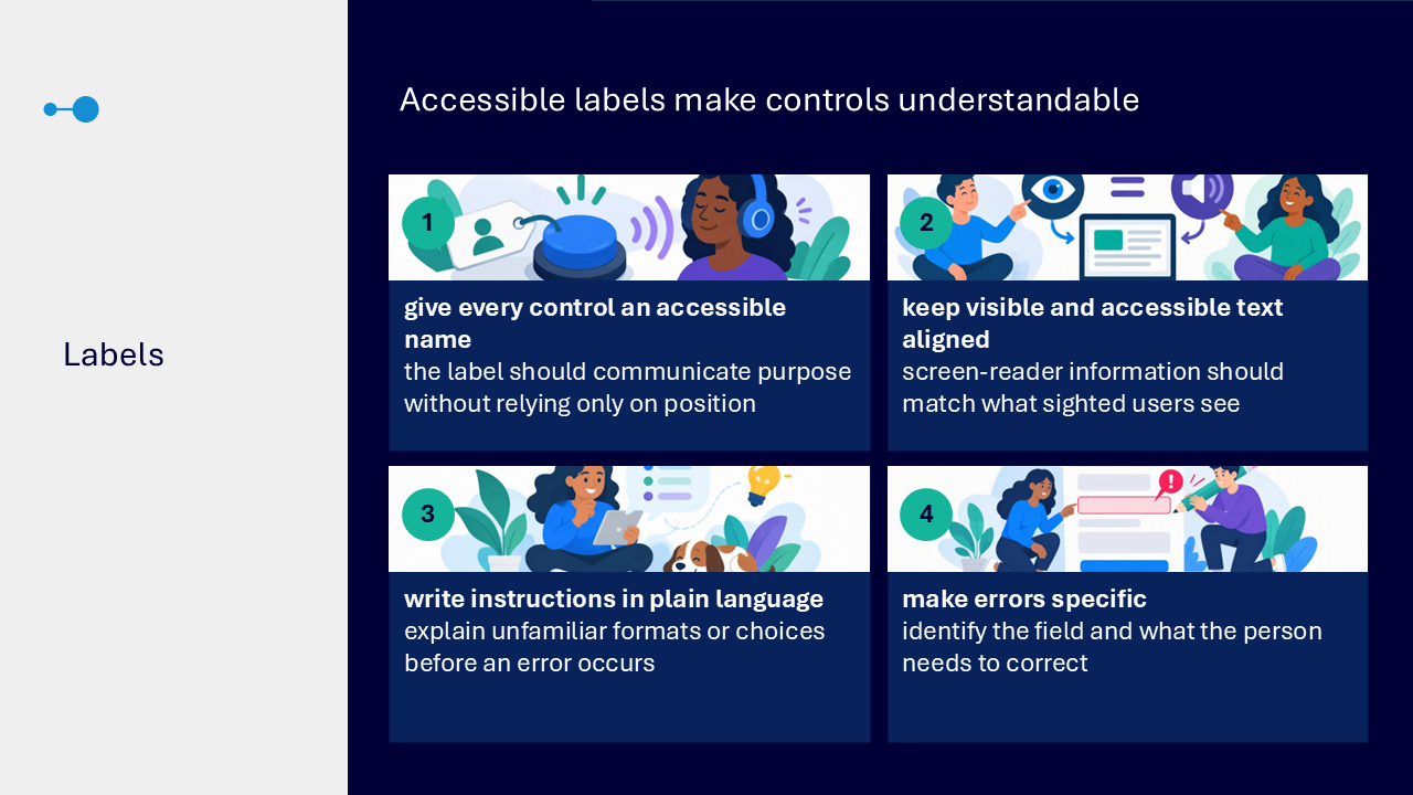
- give every control an accessible name that communicates its purpose
- keep visible and accessible text aligned
- explain unfamiliar formats or choices in plain language before an error occurs
- make errors identify the field and what needs correcting
Use strong contrast and more than colour
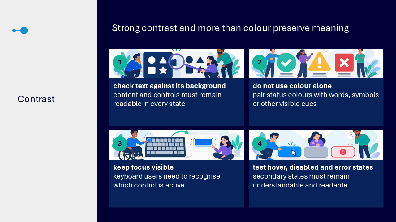
- check text against its background in every control state
- pair status colours with words, symbols or another visible cue
- keep keyboard focus visible
- test hover, disabled and error states for readability and meaning
Set a logical reading order
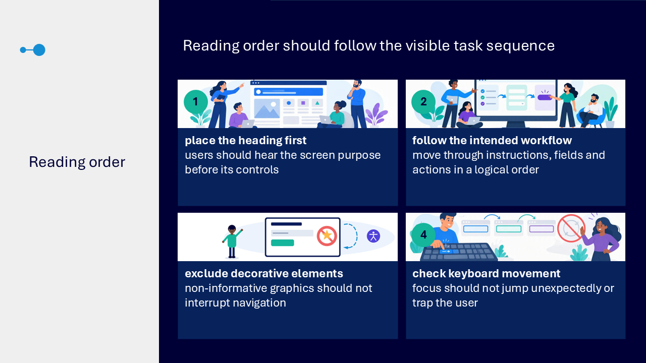
- place the screen heading first
- follow the intended sequence through instructions, fields and actions
- exclude decorative elements from navigation
- check that keyboard focus does not jump unexpectedly or trap the user
Support larger text
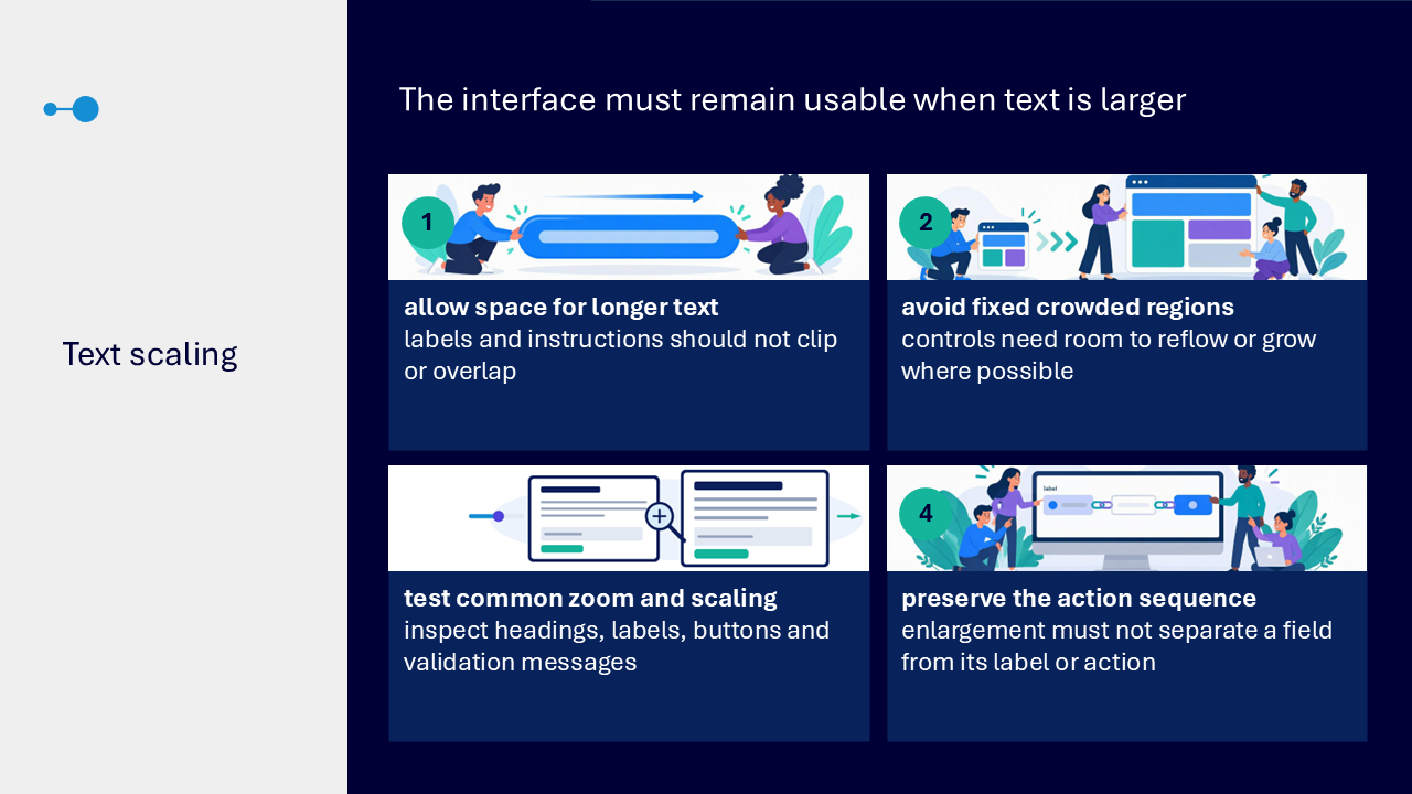
- allow labels and instructions enough space to avoid clipping or overlap
- avoid fixed crowded regions
- test headings, labels, buttons and validation messages at common zoom and scaling
- keep fields connected with their labels and actions
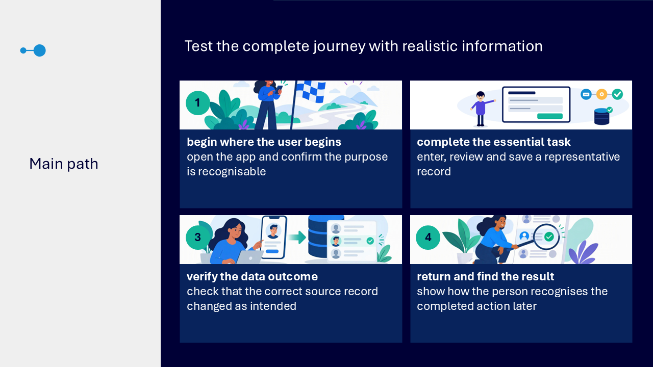
Test the main path
- begin where the user begins and confirm the purpose is recognisable
- enter, review and save realistic information
- check that the correct source record changed as intended
- show how the completed result can be found again
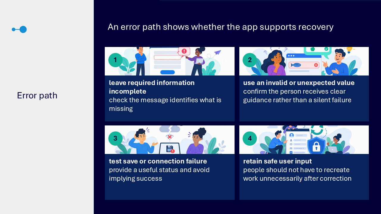
Test recovery from errors
- leave required information incomplete and check that the message identifies what is missing
- use an invalid or unexpected value and look for clear guidance
- test a save or connection failure without implying success
- retain safe user input so work does not need to be recreated unnecessarily
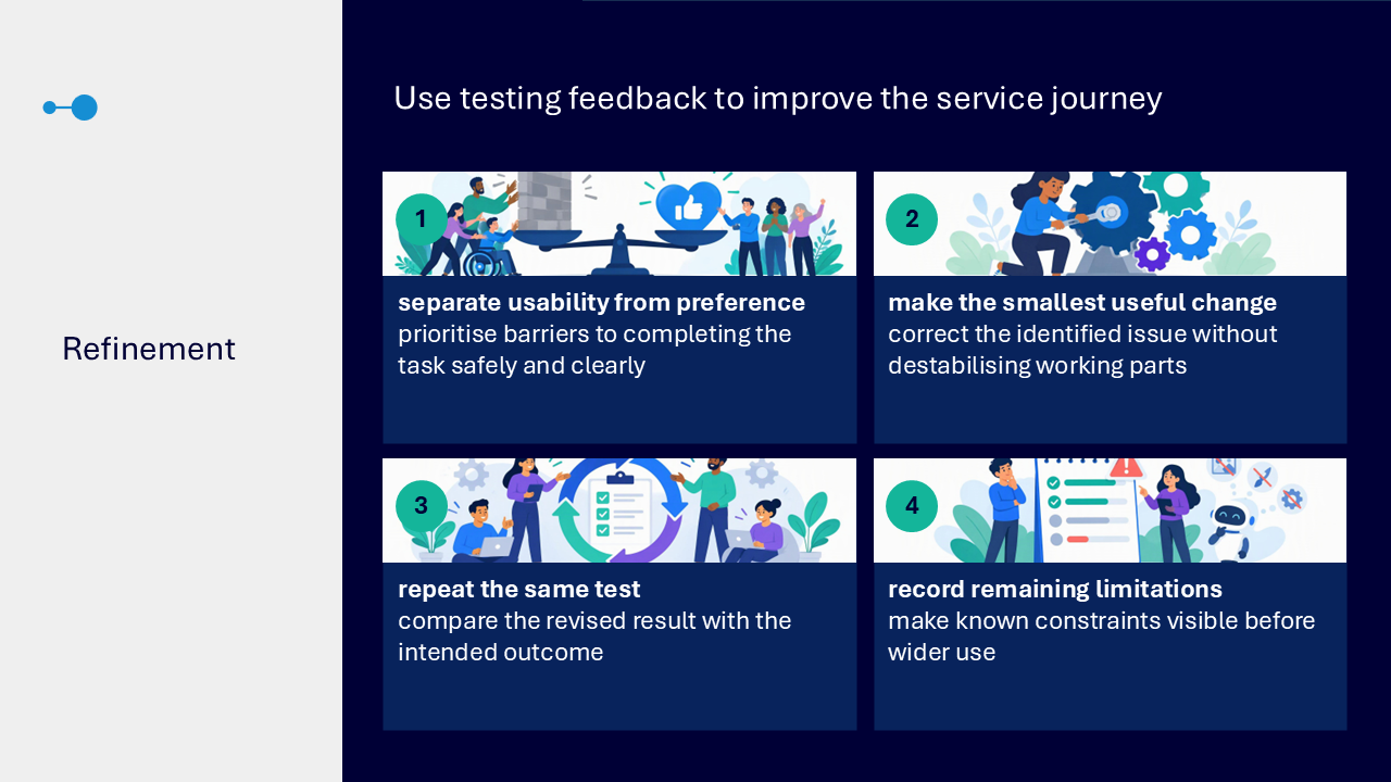
Refine from testing evidence
- separate barriers to completing the task from personal preferences
- make the smallest useful change without destabilising working parts
- repeat the same test and compare with the intended outcome
- record remaining limitations before wider use
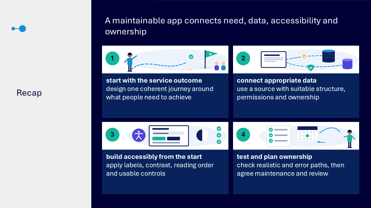
Plan a maintainable app
- start with the service outcome and one coherent user journey
- use a data source with suitable structure, permissions and ownership
- build accessibility into labels, contrast, reading order and controls
- test realistic and error paths
- agree maintenance, ownership and review before wider use
What the visuals and demonstrations showed
The visual sequence followed one app from the service need through data, interface design, accessibility, testing and ownership.
- describing the current task and observable service outcome
- checking whether an app improves a repeatable interaction
- mapping entry, essential steps, confirmation and return routes
- connecting suitable Microsoft Lists or SharePoint data
- checking columns, data types, ownership and permissions
- designing browse, detail and edit screens
- matching controls and forms to data and actions
- writing clear labels, action buttons and specific errors
- checking contrast, non-colour cues and visible focus
- setting reading order and testing keyboard movement
- checking text scaling and layout
- completing a realistic main path
- testing missing information, invalid values and save failure
- making the smallest useful change and documenting limitations
Key takeaways
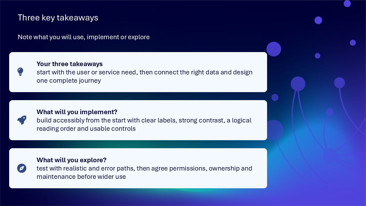
- start with the user or service need
- connect the right data and design one complete journey
- build accessibility in from the start
- use clear labels, strong contrast and logical reading order
- test both realistic and error paths
- check the source record after saving
- agree permissions, ownership and maintenance before wider use
A dependable Power Apps journey
- define the person, task and service outcome
- check that a guided app is appropriate
- map the journey
- connect suitable maintained data
- build purposeful screens, controls and forms
- apply accessible labels, contrast and reading order
- test success, error and recovery routes
- refine and assign ownership
Actions you can take
Try the tip of the month
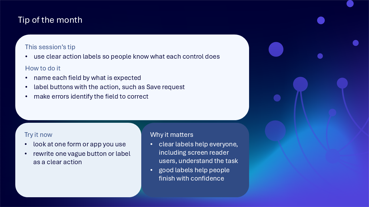
This session’s tip: use clear action labels so people know what each control does
How to do it: name each field by what is expected, label buttons with the action such as Save request, and make errors identify the field to correct
Why it matters: clear labels help everyone, including screen-reader users, understand the task and finish with confidence
Try it now: look at one form or app you use and rewrite one vague button or label as a clear action
Build confidence with one practical route
- choose one service task with visible friction
- state the person, practical outcome and first scope
- map the entry point, essential steps, confirmation and return route
- check the connected data fields, ownership and permissions
- give each screen one recognisable purpose
- replace vague labels with clear field and action wording
- check contrast, focus and reading order
- complete one realistic record from start to finish
- test one missing-field or error route
- record the smallest useful improvement and next review point
Questions and feedback
Questions are welcome. If something is unclear, ask for it to be explained another way or demonstrated again.
Complete the Support and Skilling Week feedback form
Contact WeChange.AI
For skilling queries, email training@wechange.ai.
Andrew Boxall, Managing Director: andrew@wechange.ai
Paul Ford, Industry Director for Education and Philanthropies: paul@wechange.ai
Josh Wilson, Industry Specialist: josh@wechange.ai
Elle Avilla, Customer Success and Delivery Skilling Lead: elle@wechange.ai
Izzy Pochin, Resources and Accessibility Lead: izzy@wechange.ai
Activity sheet
Follow one service need from the current task and user outcome through connected data, purposeful screens, accessible controls, realistic testing and maintainable ownership.
How to use this activity sheet
This sheet supports Session 20: Microsoft Power Apps. Use it after the live session, or follow selected activities while your trainer demonstrates one small app journey from service need to tested result.
- work at your own pace and pause after each activity
- use a prepared practice app, data source or fictional service scenario
- build one complete useful journey rather than several unfinished features
- use safe, non-sensitive practice information
- make accessibility, permissions and maintenance part of the design from the start
What you will achieve
- describe the current task, friction and observable service outcome
- decide whether a guided app interface is suitable
- map the entry point, essential steps, confirmation and return route
- choose an appropriate Microsoft Lists or SharePoint data source
- review data types, required fields, identifiers, status and ownership
- give browse, detail and edit screens distinct purposes
- choose controls that match the information and action
- use forms for new, view and edit journeys
- write clear visible labels, accessible names, instructions and error messages
- use strong contrast, non-colour cues and visible focus
- create a logical reading and keyboard order
- review larger-text behaviour for clipping, overlap and task sequence
- test the complete main path and verify the data outcome
- test incomplete, invalid and failed-save routes
- make the smallest useful refinement and record remaining limitations
- agree permissions, ownership, maintenance and review before wider use
Your learning route
| Stage | You will practise |
|---|---|
| 1. Define the need | person, task, friction and service outcome |
| 2. Map the journey | entry, essential steps, confirmation and return |
| 3. Connect data | source, fields, quality, ownership and permissions |
| 4. Build the interface | screens, controls and forms |
| 5. Build accessibly | labels, contrast, focus, reading order and text scaling |
| 6. Test and refine | main path, error path and smallest useful change |
| 7. Maintain | permissions, ownership, limitations and review |
Before you start
- sign in to the Power Apps environment provided by your organisation
- choose one small, repeatable service task
- prepare a safe Microsoft Lists or SharePoint practice source where authorised
- identify people who enter, review, approve or maintain the information
- avoid changing a live service during practice
- allow about 45 to 60 minutes, or complete one activity at a time
Notice: Power Apps creation, connectors, sharing, data access and available controls depend on organisational settings, licences and permissions. Complete only the activities available and authorised in your environment.
Activity 1: Start with the person, task and service outcome
Outcome: Define the service improvement before choosing screens or controls.
- Describe what somebody is trying to complete.
- Identify where the current form, spreadsheet or hand-off creates friction.
- Name the practical outcome the app should improve.
- Make the improvement observable, such as fewer hand-offs or clearer updates.
- Identify people entering, reviewing, approving or maintaining information.
- Keep the first scope to one complete useful journey.
| Service question | Your answer |
|---|---|
| Who is trying to complete the task? | |
| What are they trying to do? | |
| Where does friction occur? | |
| What observable improvement is needed? | |
| Who else touches the information? | |
| What is the first bounded journey? |
Pause and check
Activity 2: Decide whether an app is suitable
Outcome: Use an app only where a guided interface improves a repeatable interaction.
- Check whether people repeatedly view, add or update structured information.
- Compare the proposed interface with the current route.
- Identify unnecessary steps that should be removed rather than digitised.
- Name any decision, exception or supporting process that remains outside the app.
- Confirm that one guided journey will make the task clearer or easier.
| Suitability check | Your finding |
|---|---|
| repeatable interaction | |
| structured information | |
| service benefit | |
| unnecessary step removed | |
| human decision or exception retained |
Pause and check
Activity 3: Map the complete user journey
Outcome: Define how a person begins, completes and safely leaves the task.
- Describe how the person reaches the app.
- Write how they recognise it is the correct place.
- List only the essential information and actions.
- Describe the visible confirmation after save or submission.
- Plan a safe route after success.
- Plan a safe route after cancellation or an error.
| Journey point | Your description |
|---|---|
| entry point | |
| recognition of purpose | |
| essential step 1 | |
| essential step 2 | |
| success confirmation | |
| success return route | |
| cancel or error return route |
Pause and check
Activity 4: Choose the connected data source
Outcome: Select a source whose structure, ownership and permissions support the service need.
- Identify the Microsoft Lists or SharePoint source that fits the task.
- Check the source purpose and current owner.
- Review the columns and data types.
- Check the quality and consistency of current values.
- Review who can read and update the source.
- Confirm that the app will not bypass source permissions.
| Data-source check | Your finding |
|---|---|
| source and purpose | |
| owner or maintainer | |
| important columns and types | |
| data-quality issue | |
| read access | |
| update access |
Pause and check
Activity 5: Design reliable fields and responsibilities
Outcome: Collect only information needed for the task, outcome or follow-up.
- List each field the app needs.
- Remove a field that does not support the task or follow-up.
- Match each field to a suitable source column type.
- Make required fields proportionate.
- Identify the record identifier.
- Define the status values.
- Record who maintains the field structure and option values.
| Field decision | Your plan |
|---|---|
| field and purpose | |
| column type | |
| required or optional | |
| identifier | |
| status values | |
| maintainer |
Pause and check
Activity 6: Give each screen one recognisable purpose
Outcome: Separate browsing, context and change into predictable screen roles.
| Screen | Main purpose | Your content |
|---|---|---|
| start or browse | recognise records or the next action | |
| detail | view the selected record without forcing an edit | |
| edit | add or update information |
- Name each screen by its purpose.
- Place only controls needed for that role.
- Make back, home, save and cancel behaviour consistent.
- Remove a control that belongs on another screen.
- Check that users can predict what will happen next.
Pause and check
Activity 7: Choose controls that match the information and action
Outcome: Use understandable controls that fit the connected data.
- Give every field a visible label.
- Choose text, date, choice or toggle controls only where they fit the data.
- Use clear action language on buttons, such as Save request.
- Avoid vague labels such as Submit or OK where a specific action is possible.
- Group related controls.
- Add spacing so the interaction is not crowded.
| Control check | Your choice |
|---|---|
| field label | |
| input control | |
| button label | |
| related group | |
| spacing or layout change |
Pause and check
Activity 8: Use forms for new, view and edit journeys
Outcome: Connect the interface with records while protecting context and confirming results.
- Use a new form for creating a record.
- Make the blank state and required information clear.
- Use a view form where people should read without editing.
- Use an edit form for changing a selected record.
- Show which record is being changed.
- Provide success feedback after saving.
- Provide failure feedback and a useful next step.
| Form mode | Purpose | Feedback or safeguard |
|---|---|---|
| new | ||
| view | ||
| edit | ||
| success | ||
| failure |
Pause and check
Activity 9: Align visible labels and accessible names
Outcome: Make each control understandable without relying on position or visual appearance.
- Identify the visible label for each control.
- Check the accessible name available to assistive technology.
- Keep visible and accessible wording aligned.
- Explain unfamiliar formats or choices before an error occurs.
- Remove wording that relies on left, right, above or below alone.
| Control | Visible label | Accessible name | Instruction, if needed |
|---|---|---|---|
Pause and check
Activity 10: Make errors specific and recoverable
Outcome: Tell the person which field needs attention, what happened and what to do next.
- Leave one required field incomplete.
- Check that the error names the affected field.
- Enter one invalid or unexpected value.
- Check that the message explains the correction.
- Confirm the error does not disappear before it can be understood.
- Retain safe user input so the person does not recreate work unnecessarily.
| Error path | Observed message | Improvement |
|---|---|---|
| missing required field | ||
| invalid value | ||
| failed save or connection | ||
| retained user input |
Pause and check
Activity 11: Check contrast, colour and focus
Outcome: Preserve meaning and active-control awareness across visual states.
- Check text and controls against their backgrounds.
- Pair status colour with words, icons or another visible cue.
- Check the visible focus indicator for keyboard users.
- Review normal, hover, disabled and error states.
- Check the interface at high zoom.
- Remove decoration that competes with the task.
| Visual check | Finding | Action |
|---|---|---|
| text and background contrast | ||
| non-colour status cue | ||
| focus indicator | ||
| hover state | ||
| disabled state | ||
| error state |
Pause and check
Activity 12: Set a logical reading and keyboard order
Outcome: Follow the visible task sequence without unexpected jumps or traps.
- Place the screen heading first.
- Follow with instructions.
- Move through fields in the intended workflow order.
- Place the primary and secondary actions logically.
- Exclude decorative elements from navigation where appropriate.
- Use the keyboard to move through the screen.
- Correct an unexpected jump or trapped focus.
| Order | Object or control |
|---|---|
| 1 | screen heading |
| 2 | |
| 3 | |
| 4 | |
| 5 |
Pause and check
Activity 13: Test larger text and scaling
Outcome: Keep labels, controls, validation and action sequence usable when text is enlarged.
- Increase the available zoom or text scaling.
- Inspect headings and instructions.
- Inspect field labels and input controls.
- Inspect button labels and validation messages.
- Look for clipping, overlap or separation of a field from its label.
- Adjust crowded or fixed regions where possible.
- Repeat the scaled test.
| Scaling check | Finding | Action |
|---|---|---|
| headings and instructions | ||
| field labels and controls | ||
| buttons | ||
| validation messages | ||
| task sequence |
Pause and check
Activity 14: Test the complete main path
Outcome: Prove the realistic journey from entry through data outcome and later retrieval.
- Begin where the user begins.
- Confirm that the app purpose is recognisable.
- Enter realistic, safe information.
- Review the record before saving.
- Save the record.
- Confirm the success message.
- Check that the correct source record changed.
- Return to the app and find the completed result.
| Main-path check | Your finding |
|---|---|
| entry and purpose | |
| information entered | |
| review before save | |
| success feedback | |
| source record verified | |
| result found again |
Pause and check
Activity 15: Test the error and failure paths
Outcome: Check that the app supports recovery without implying success or losing safe work.
- Leave required information incomplete.
- Use one invalid or unexpected value.
- Test or simulate a save or connection failure where safe and authorised.
- Check that the status explains what happened.
- Check that success is not implied.
- Correct the issue.
- Repeat the same scenario.
| Failure scenario | Expected support | Observed result | Correction |
|---|---|---|---|
| missing information | |||
| invalid value | |||
| save or connection failure |
Pause and check
Activity 16: Refine and plan ownership
Outcome: Improve the identified barrier and record how the app will remain safe and useful.
- Separate a usability barrier from a preference.
- Choose the highest-impact barrier.
- Make the smallest useful change.
- Repeat the same test.
- Record any remaining limitation.
- Name the app owner.
- Name the data-source owner.
- Record who reviews permissions, feedback and future changes.
- Choose the next review point.
| Maintenance record | Your entry |
|---|---|
| barrier corrected | |
| smallest change | |
| retest result | |
| remaining limitation | |
| app owner | |
| data owner | |
| permissions or feedback reviewer | |
| next review point |
Pause and check
Put it into practice: build one complete service-improvement journey
Scenario: A service team currently receives requests through an awkward spreadsheet and message hand-off. People need a clear way to create a request, verify what was saved and return to the record later, while reviewers need dependable data and ownership.
- define the person, current task, friction and observable service outcome
- confirm that a guided app interface improves the interaction
- map entry, essential steps, confirmation and return
- choose an appropriate Microsoft Lists or SharePoint source
- review fields, types, identifiers, statuses, ownership and permissions
- create browse, detail and edit screen purposes
- choose understandable controls and action labels
- align visible labels and accessible names
- check contrast, non-colour cues, focus, reading order and larger text
- test the complete main path and verify the source record
- test missing, invalid and failure paths
- make one evidence-based refinement
- record app ownership, data ownership, permissions, limitations and review point
The service need and outcome: ____________________________________________________________________
The user journey: ____________________________________________________________________
The data source and ownership: ____________________________________________________________________
The screens, controls and accessibility checks: ____________________________________________________________________
The test, refinement and review point: ____________________________________________________________________
Quick reference: choose the Power Apps design response
| If you need to… | Try… |
|---|---|
| decide whether an app is suitable | check for a repeatable structured interaction and observable service benefit |
| keep the first build manageable | one complete user journey |
| store structured service information | an appropriate Microsoft Lists or SharePoint source |
| help people recognise records | a browse screen |
| show context without editing | a detail screen or view form |
| create or change a record | a new or edit form |
| make controls understandable | clear visible labels and aligned accessible names |
| show the action clearly | specific button text such as Save request |
| preserve meaning beyond colour | words, icons or another visible cue |
| support keyboard use | visible focus and logical order |
| support larger text | space for reflow and checks for clipping or overlap |
| prove the service journey | realistic main-path testing and source verification |
| support recovery | specific errors, retained safe input and failure-path testing |
| protect continuity | app owner, data owner, permissions and review point |
Your three takeaways
My most useful learning: ____________________________________________________________________
What I will implement: ____________________________________________________________________
What I will explore further: ____________________________________________________________________
If you need help
- name the screen, control, form, data source or test path involved
- state the expected result and observed result
- note the exact visible error or unexpected behaviour
- ask your local support route about Power Apps access, connectors, permissions, sharing or unavailable features
- avoid sharing screenshots containing personal, confidential or sensitive information
Confidence grows through a complete app journey: start with the service outcome, connect dependable data, build accessibly, test realistic and failure paths, and make ownership clear before wider use.
Reflective journal
Why we ask you to reflect
Continuing Professional Development (CPD) is formative and it is about what it achieves for you and your organisation.
Instead of formally assessing your learning, we ask you to write a reflective note. This should reflect on how the learning was relevant and how it will impact your working practices.
Taking time to reflect on your learning makes it more likely you will embed it in your future practice.
What to cover and when
What your reflection should cover
- how the learning was relevant to you
- how the learning will impact your practice
When to complete it
Reflect as soon as possible following the skilling session. This keeps your note contemporaneous (written close to the time) and meaningful. Fill it in on your device, so the boxes expand as you type.
| Topic | What to know |
|---|---|
| Timing | Complete the note as soon as possible after the training event. |
| Purpose | To embed the learning within your subsequent practice. |
| Focus | How the learning was relevant and how it will impact your practice. |
Your reflective note
Complete each row below. Write in your own words. Your notes are private to you unless you choose to share them.
| Prompt | Your response |
|---|---|
| Skilling session title | |
| Date of the skilling session | |
| Date you completed this note | |
| How was the learning relevant to you and your work? | |
| How will the learning impact your practice? |
Recommended resources
These curated resources accompany the WeChange.AI skilling offer of Continuing Professional Development (CPD) accredited, and non-accredited, sessions. Use them before a session to build familiarity, or afterwards to revisit and apply the learning in day-to-day work.
Alongside these resources, Navigator helps WeChange.AI customers find personalised recommendations and available learning on Microsoft 365 tools, accessibility and AI relevant to their role. Returning to Navigator after a session can help you connect new knowledge with practical workplace needs, choose a useful next step and keep learning visible as confidence grows.
Introduces canvas apps, the maker portal and data sources, and builds a first app from an Excel spreadsheet. It also covers using Copilot to generate an app from an uploaded file.
A shorter beginner module on creating an app from a template. It covers the building blocks, data sources and how to manage the app afterwards.
Explains how to create an app from a list, with the app opening in Power Apps Studio. Newly generated apps use a single responsive screen that adapts to phones and tablets.
A short Microsoft Support page on creating an app for an existing list from Power Apps, Microsoft Lists or SharePoint. It points to further reading on customising list forms.
A guide to what canvas apps are, how to connect them to data such as SharePoint and Excel, and how to share them. It also includes pointers for common issues.